Time
Team
Skills
Deliverables
5 Weeks
Figma Prototype
Experimental Design
Interviews
Data Analysis
Interaction Design
3 Product Designers
We designed Art Oasis — an interactive pop-up gallery that turns the average museum visit into a more casual and customized art experience.
As our capstone project in Human-Computer Interaction, our team was challenged to create a non-web and non-mobile solution that transforms something old into something new, in an attempt to get at the question of how technology might work together with traditional methods to create something delightful and exciting.
In particular, we wanted to dive into the world of art, and begin to integrate how people in studio arts with current and developing technologies.
BACKGROUND
PROBLEM
OPPORTUNITY
Both consumers and creators of art are dissatisfied by the current ways in which museums have forged their art experiences.
How might we create more casual, approachable spaces for people to connect with art in a delightful and spontaneous way?
Art consumers say that their museum visits feel monotonous, restricting, and too contrived. Although going to museums may take too much time, effort, and money, they also feel that digital forms of art are too superficial and largely impersonal. At the same time, art creators find it difficult to share their art with the rest of the world and that current art galleries are unapproachable.

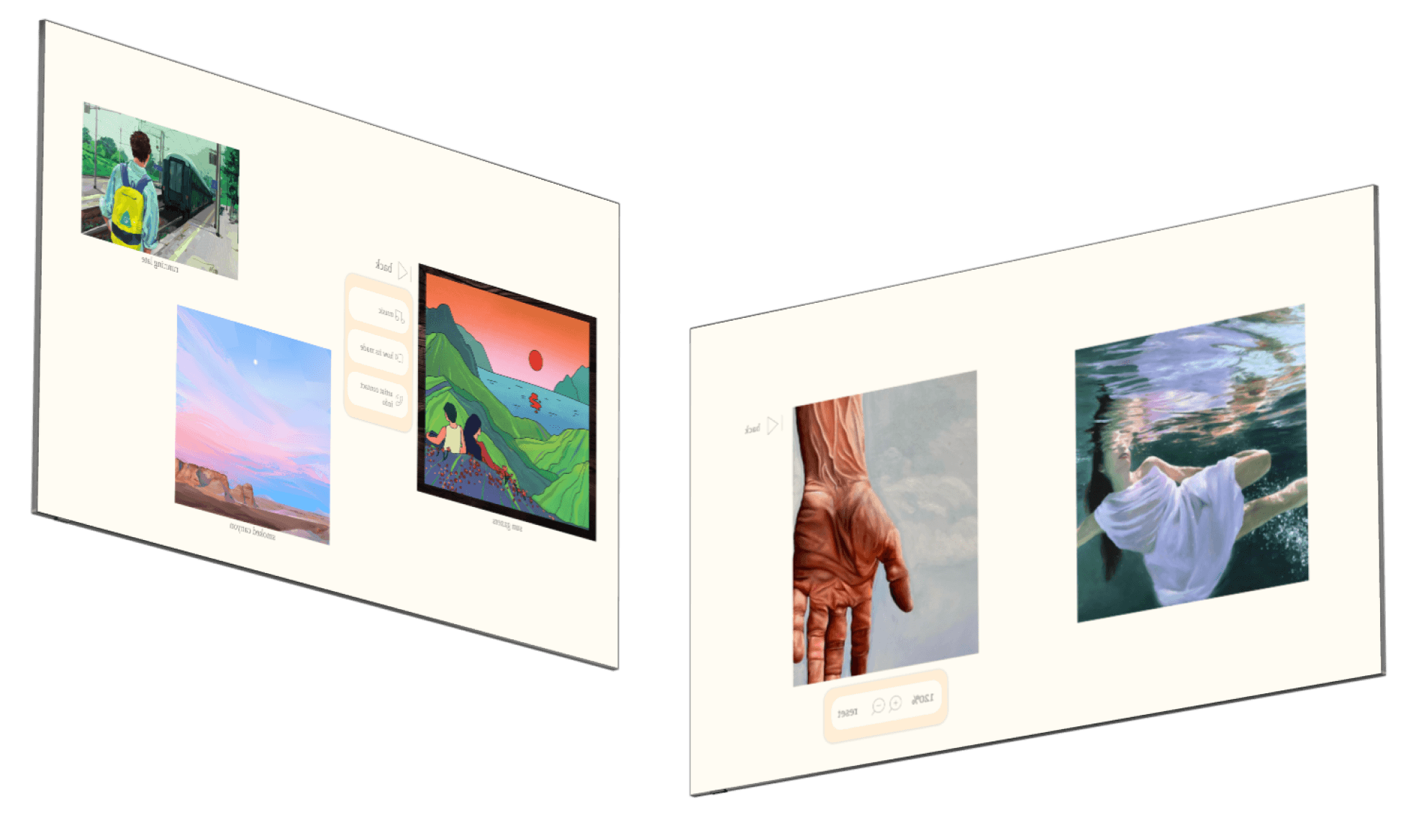
Projectable Gallery Walls
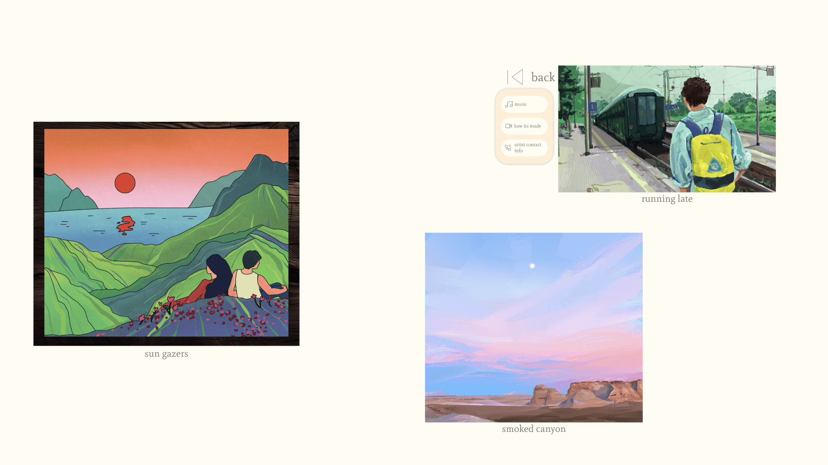
We prototyped three unique gallery walls which include art pieces from different artists, their process videos, animations, personalized music, and artist contact info. Users are then able to explore the various walls at their own pace, and are provided the opportunity to better connect with the art and the artists themselves.

Artist Onboarding Flow
We created a web-based portal for artists to be able to upload files/content that they hope to show in our pop-up gallery to the Art Oasis cloud. On the gallery screens themselves, artists can unlock their portal to access the cloud and drag and drop pieces and content to curate their own gallery wall.
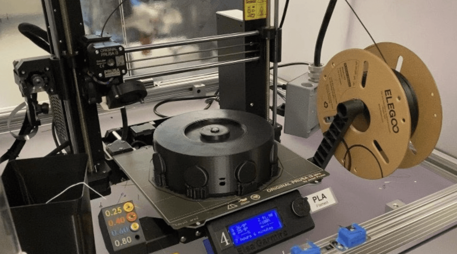
360-Degree Portable Projector
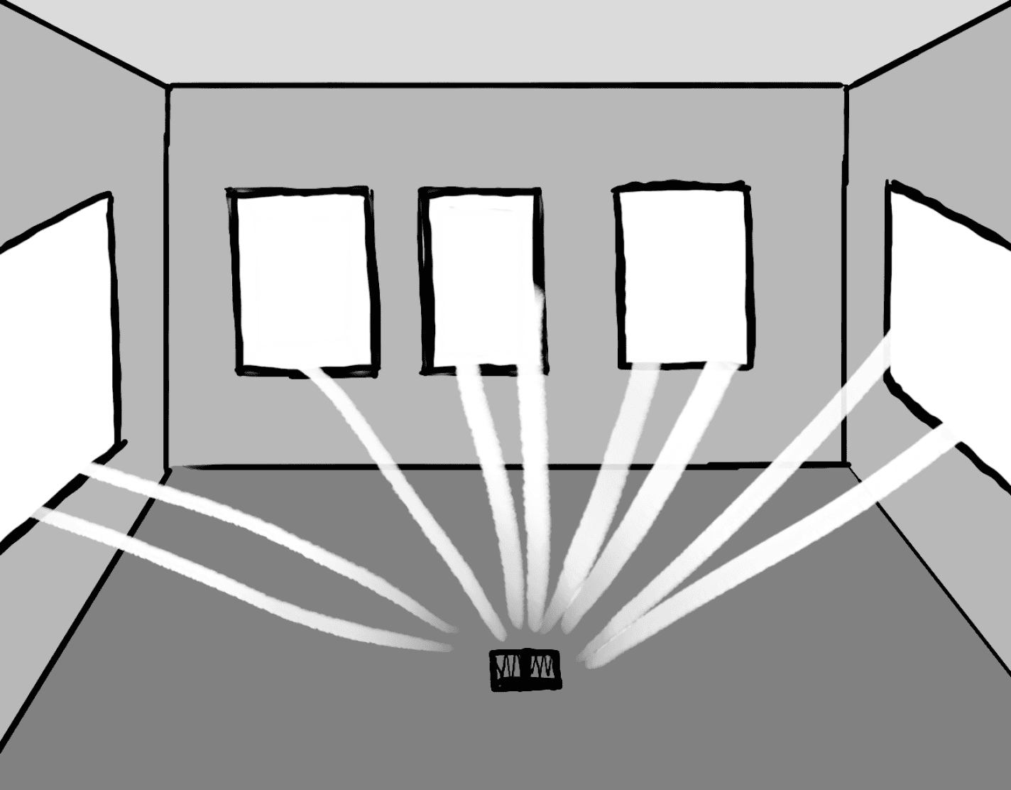
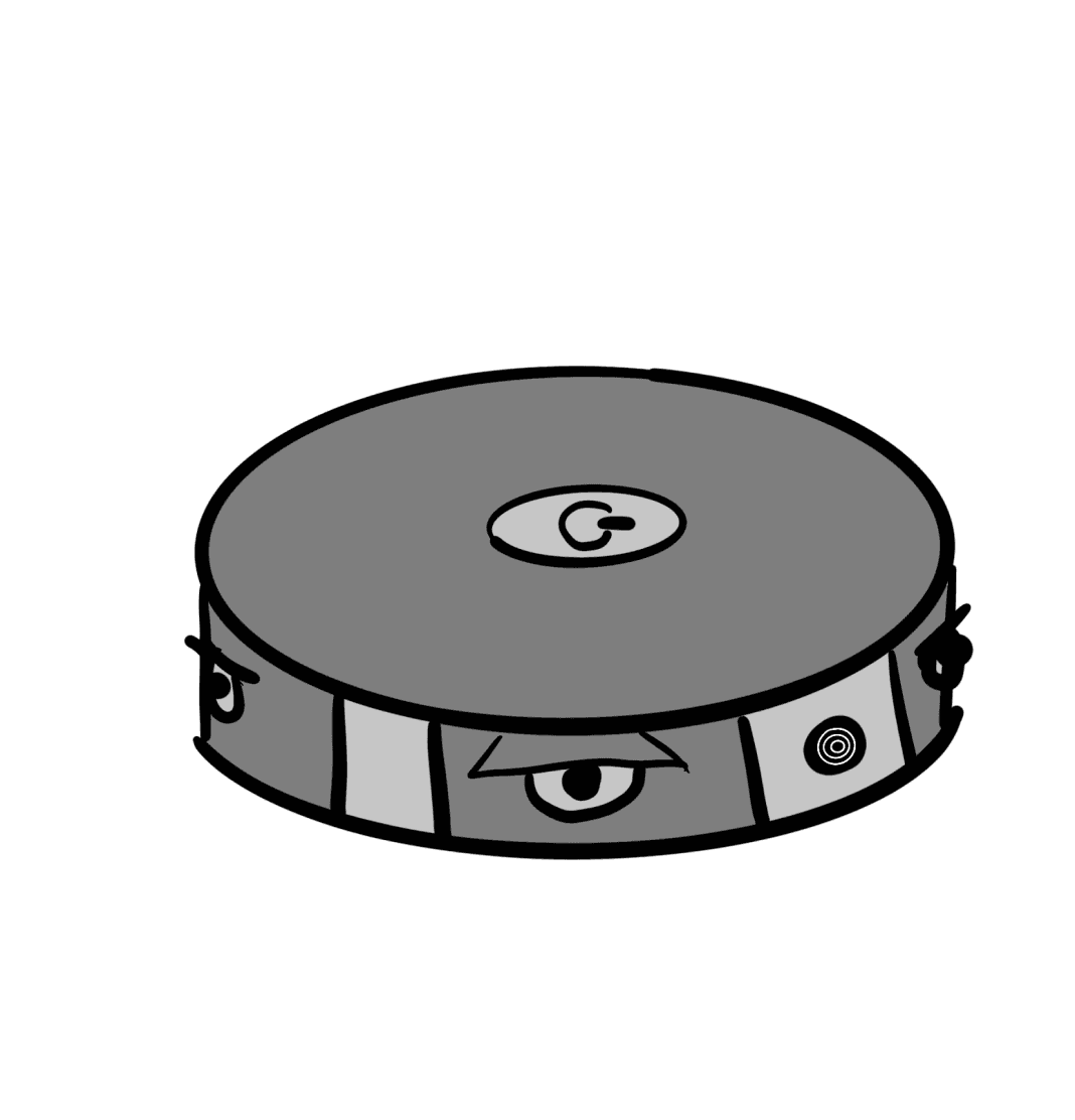
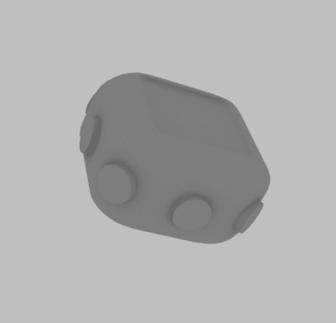
We 3D-modeled and printed an all-direction projector that could be placed in the center of any room to project our gallery walls and transform the space into an art gallery. Our looks-like, feels-like prototype includes a series of 9 projector lenses as well as a touchable interface for managing settings.
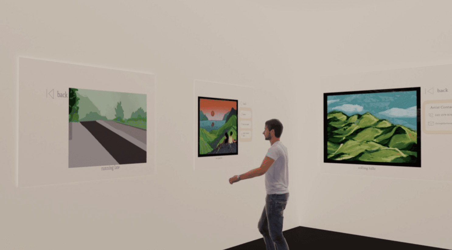
Physical Space Design
Because we were designing a full experience, we wanted to be intentional in thinking about what the physical space itself would look like. We sketched our vision for the space and then made a high-fidelity mockup in Maya.
A portable, pop-up style art gallery that enables casual art consumers to spontaneously engage with local art in a manner that allows them to connect more deeply with the artist and their process.
Art Oasis
SOLUTION
Now, how did we get to this solution?
Check out our design process below!
PROCESS OVERVIEW
User Interviews
Industry Research
Literature Review
Empathy Maps
User Personas
Journey Maps
POV Statements
HMW Statements
Goals
Brainstorming
Sketches
Information Architecture
User Flow
Lo-Fi Wireframes
Style Guide
Hi-Fi Prototype
User Feedback
Experimental Design
Takeaways
Next Steps
RESEARCH
DEFINE
IDEATE
PROTOTYPE
TEST
REFLECT
RESEARCH
User Interviews, Empathy Maps
In order to understand the various nuanced opinions surrounding museum experiences and interactions with art in general, we conducted in-depth interviews with:
While our questions varied for each group, we generally sought to understand the experiences of each of these groups in the art museum/gallery landscape and their pain points with their existing forms of interactions with art.
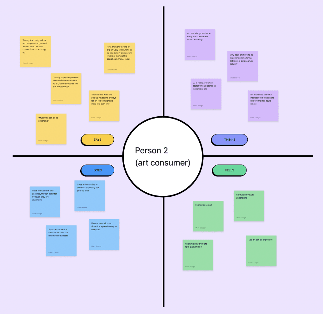
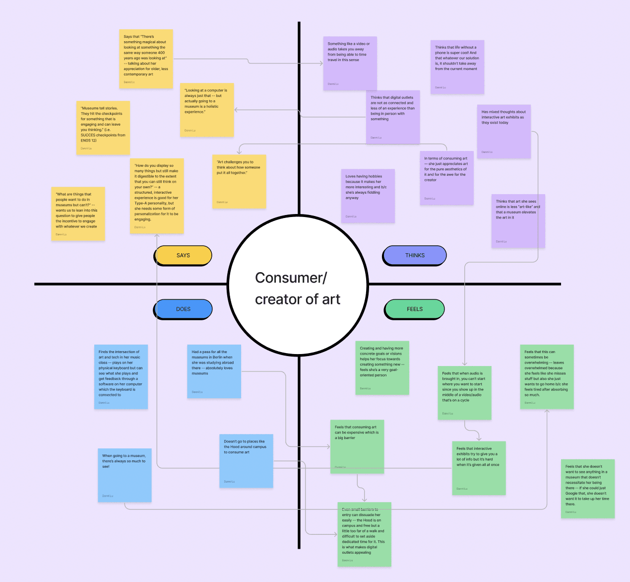
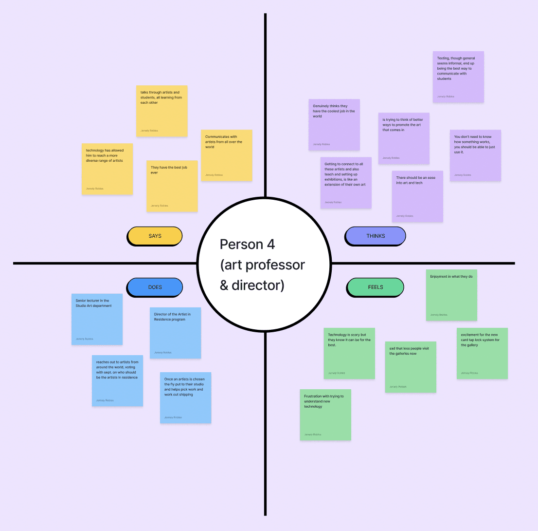
In order to be able to further empathize with each of their perspectives, we also created empathy maps according to each user group:
Consumers of art

Gallery Directors/Admnistrators

Artists
DEFINE
User Personas, User Journeys
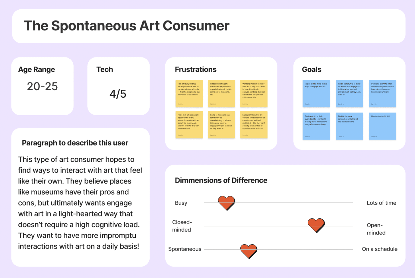
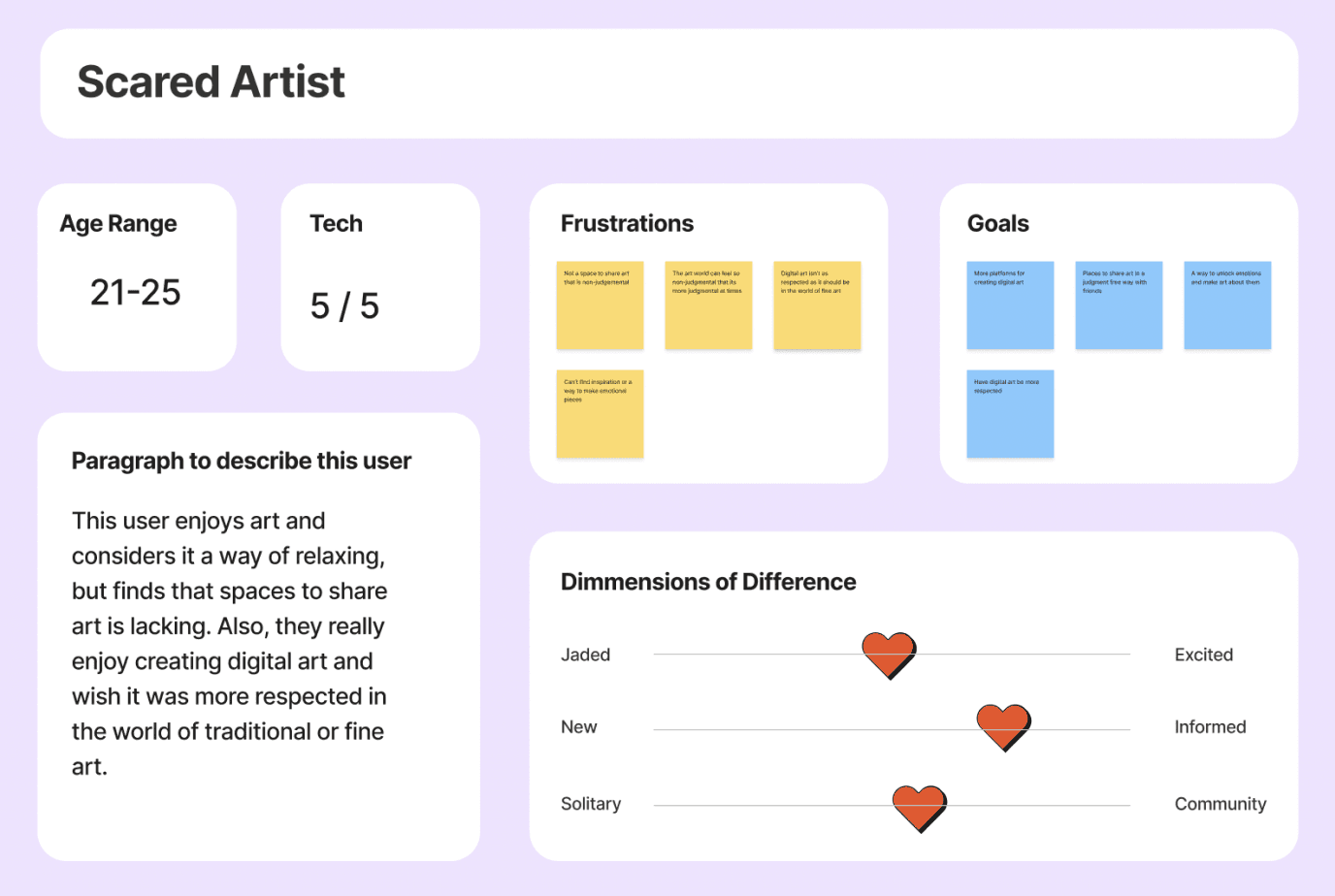
Narrowing down to focus on artists and art consumers, insights from our interviews were then condensed through user personas that outline experiences through frustrations and goals:
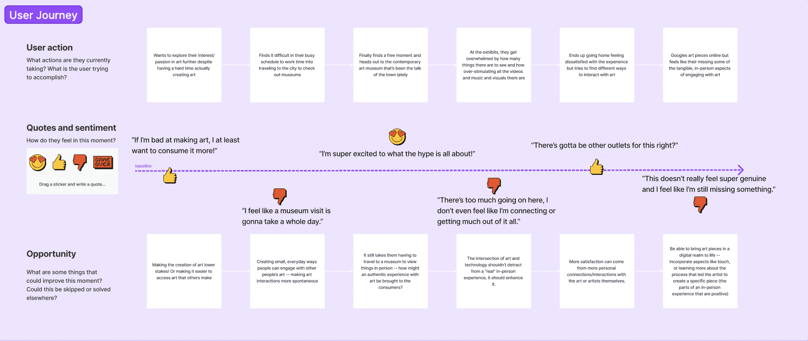
With these personas in mind, journey maps then allowed us to pinpoint possible opportunities for improvement of a user’s own journey.
DEFINE
POV Statements
With all of our condensed user insights and sentiments in mind, we further narrowed down our problem area by writing a point-of-view-statement for both of these user groups.
A spontaneous art consumer with no time for museum visits NEEDS to interact with art in a low-stakes, low-barrier way IN ORDER TO gain fulfillment in their appreciation of art and connect to it in a more personal way.

A budding artist without a large following or big name NEEDS a more casual platform with large visibility to share their art IN ORDER TO gain traction and recognition, as well as receive feedback on their work.

IDEATE
Brainstorming, Sketches
IDEATE
HMWs
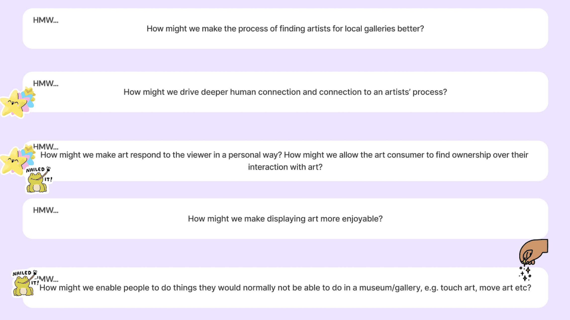
In order to get to the root of the problems identified in the above POV statements, our team brainstormed a total of 15 how-might-we questions between the personas. Consolidating them down to a list of 5, we then dot-voted to narrow down which question(s) we would focus our brainstorming towards.
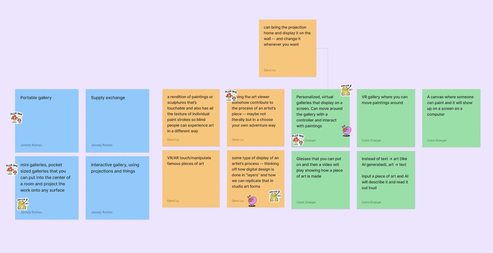
From here, an iterative process of diverging and converging ideas began. Brainstorming, dot-voting, narrowing down, repeat.
Using our favorite HMWs -- those that were most pertinent and that we were most excited to address, we conducted a brief 5-minute team brainstorm of solutions that would address the HMW questions, and again, dot-voted on our favorite ideas.
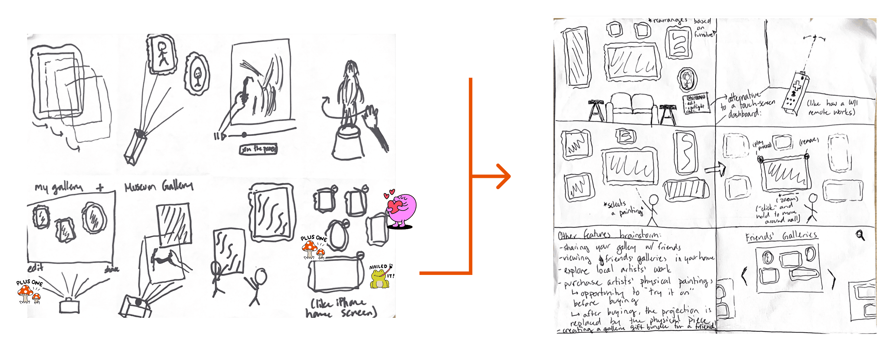
Putting our favorite ideas to paper, we utilized the Crazy 8s method to rapidly ideate and sketch out what our interactions could look like. While we each chose to focus on different aspects of our ideas, my Crazy 8s and even further narrowed solution sketches are shown here:
IDEATE
Specifications
Given our previous user research as well as the direction we narrowed down to in our sketches, we wanted to slow down our process for a moment and think critically about the specifications that we wanted our solution to fulfill:
What do we really want to achieve with our solution?
Intuitive + Simple
Casual + Spontaneous
Reflects real experiences
Elevates the artist
Versatile
Accessible
PROTOTYPE & TEST
Lo-Fi Wireframes
We wanted to create a physical space outside of a museum or art gallery where users could fully immerse themselves in a casual, yet interactive experience in the form of a pop-up style gallery. This meant being intentional about the design of the physical space itself.
As we began our low-fidelity prototyping, we went back to our user research and made 3 core realizations that informed pivotal design choices:
#1
#1
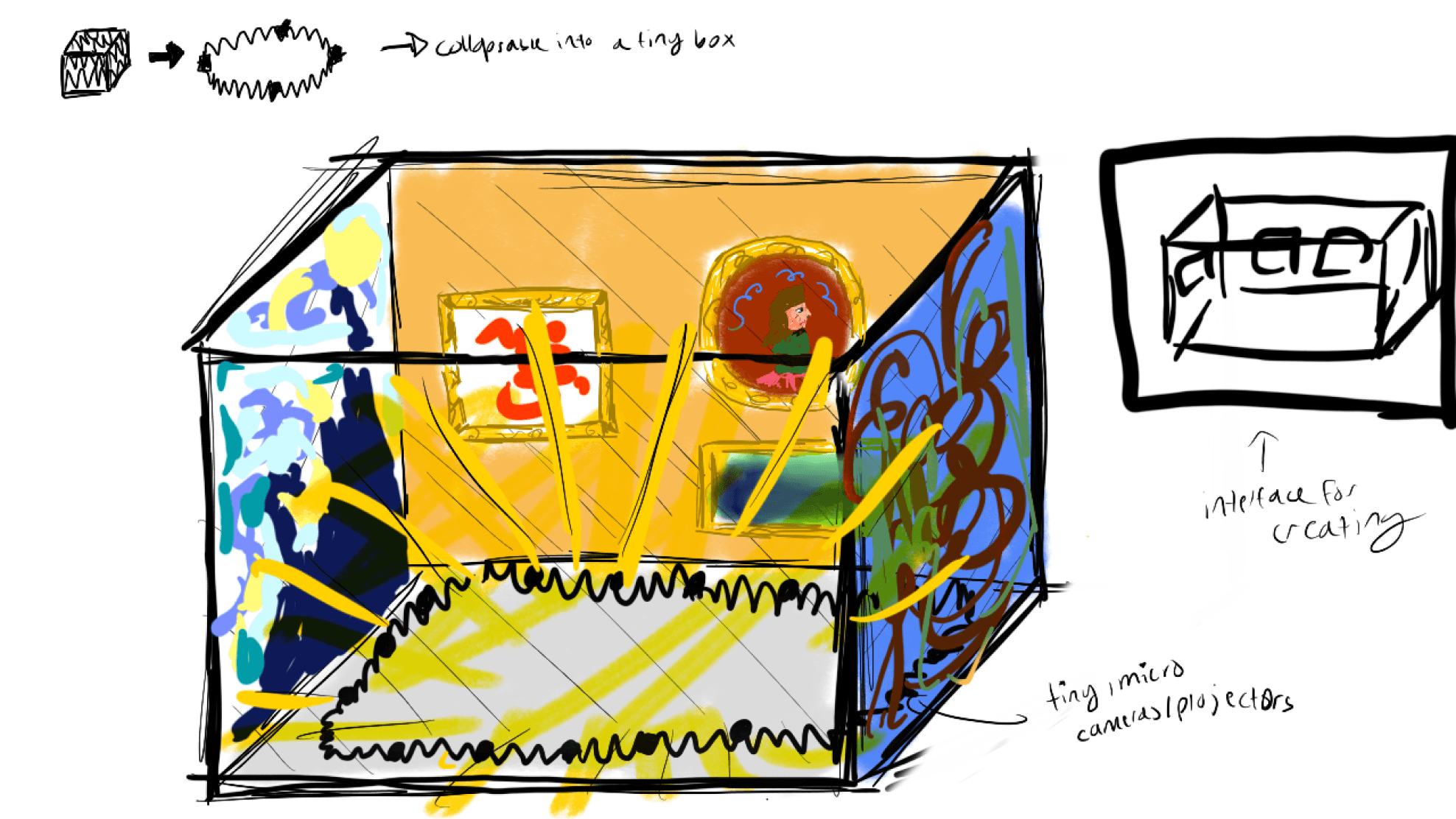
We are designing an experience, not just an interface.
In balancing the complexity of the solution and the scope of the project itself, we found it important to create some form of a low-fidelity prototype of the hardware required to bring this vision to fruition. We iterated upon and eventually 3D-printed a looks-like, feels-like prototype of the projector shown below:
User interviews had previously exposed to us that user might be reluctant to try interactive art technologies that felt overly complex and over-designed. We wanted to create simple interface that incorporates interactions analogous to that of common devices or softwares like Apple iOS.
#2
#2
#3
#3
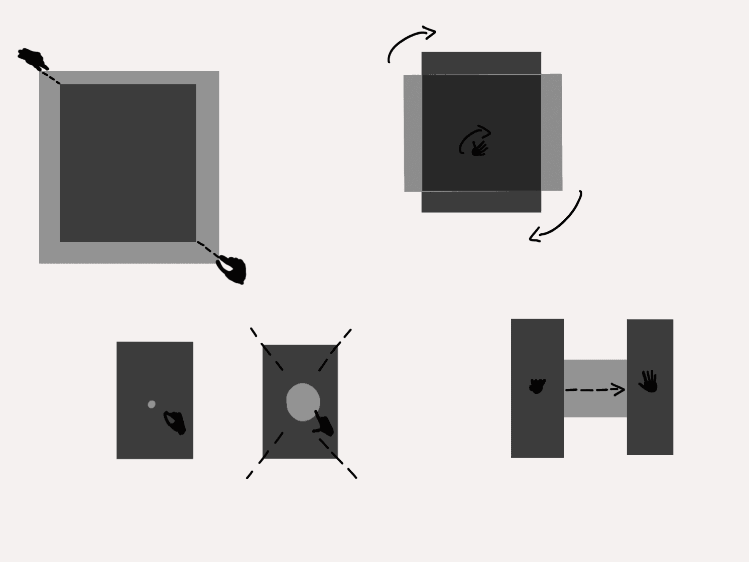
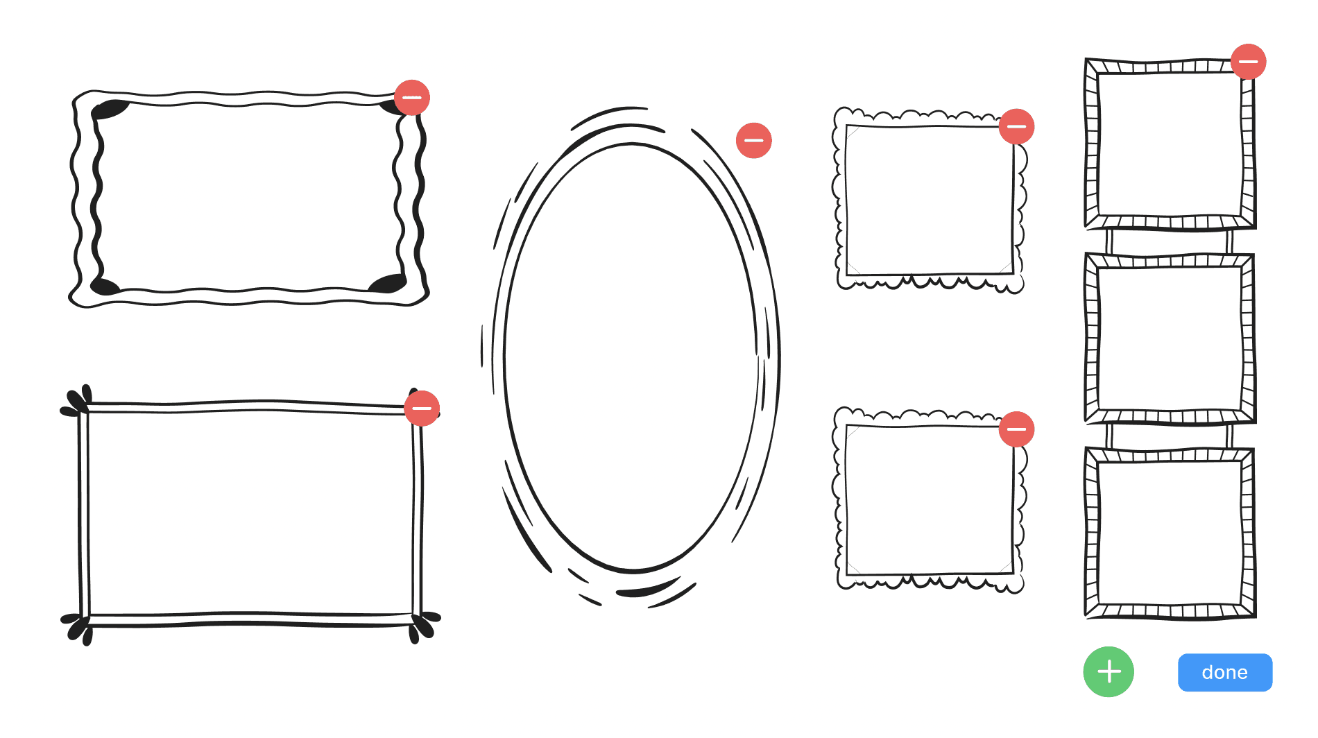
Pinch-to-zoom, drag-and-drop, as well as other interactions found on commonly used devices like iPhones
Editing a gallery wall as one might edit the apps on an iPhone homescreen
We needed to get creative with prototyping.
Leverage existing technologies in order to create intuitive, recognizable innovations.
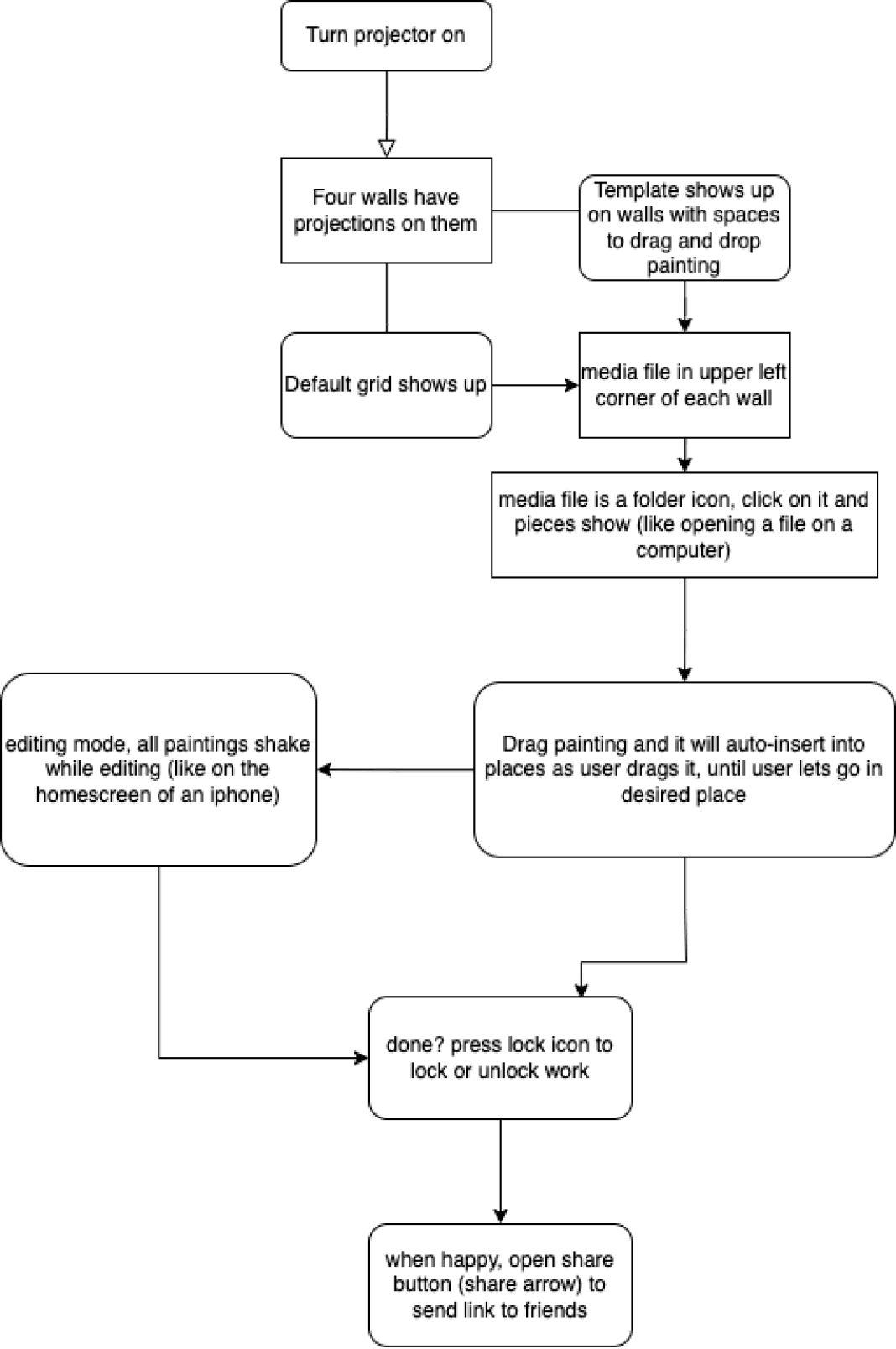
We started first with an information architecture map to visually represent our solution’s features and the hierarchy we wanted to build with them. We used this map to then lay out a user flow, informing us of how a user would actually navigate that hierarchy themselves.
With all of the different pieces of our solution prototyped, it was time to tie them all together.
PROTOTYPE
Information Architecture, User Flow Maps
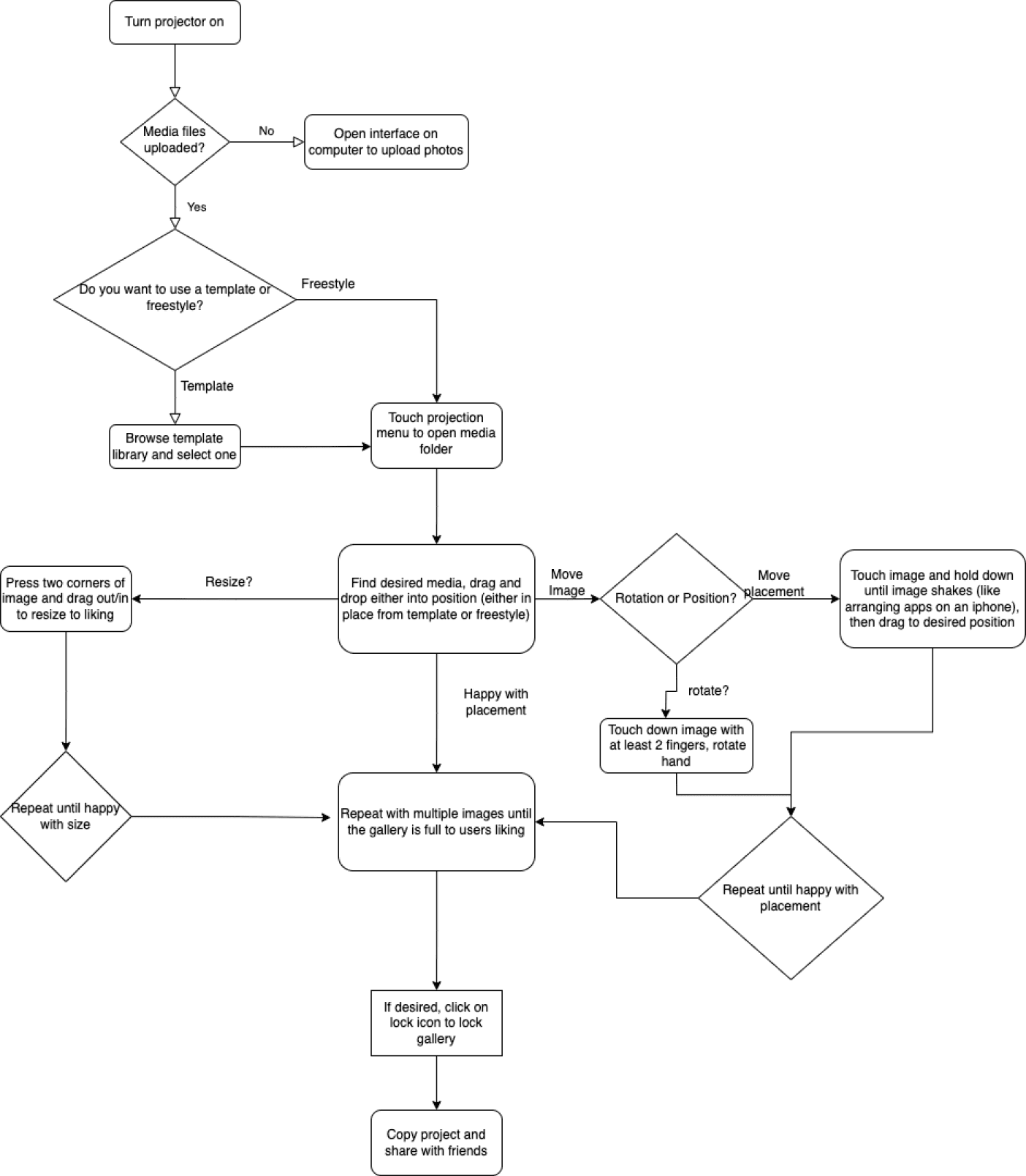
Information Architecture
User Flow
PROTOTYPE & TEST
Hi-Fi Wireframes
As we brought our grayscales into higher fidelity UI, we incorporated user feedback on two features in particular:
#1
Artists we interviewed noted that there was no onboarding process or artist-facing UI that would allow them to upload their work to our digital gallery.
#1
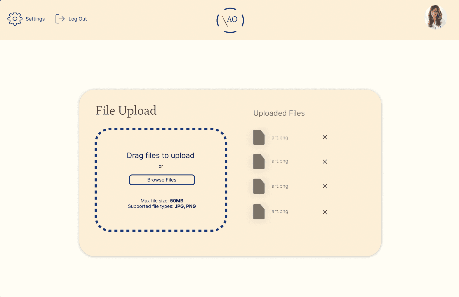

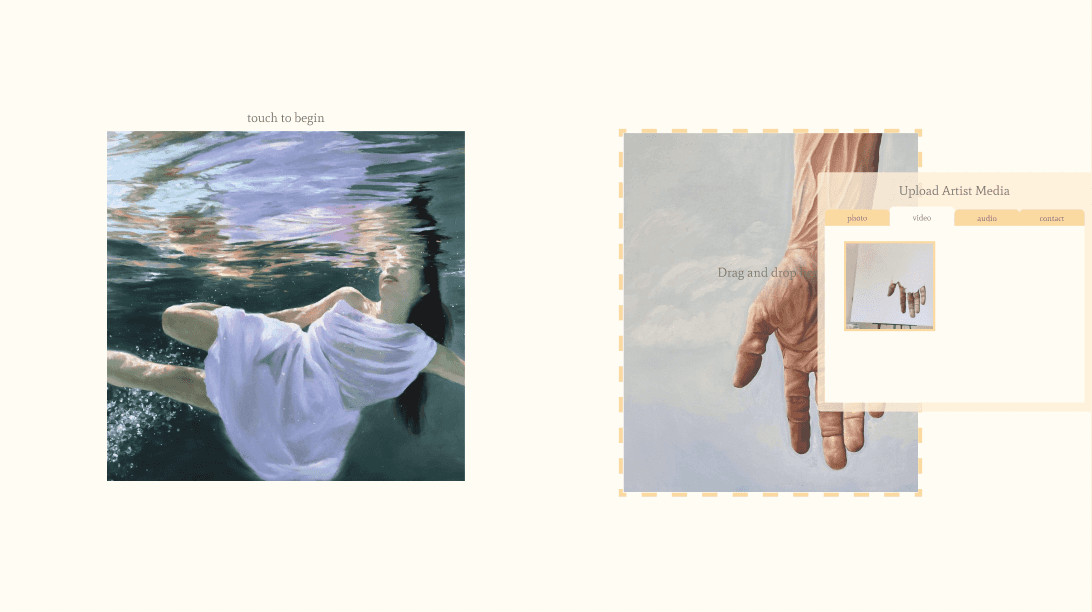
Based on this, we quickly mocked up a brief web portal where content could be uploaded to an Art Oasis cloud, and created an artist-specific flow on our interface which allowed them to select their content from that cloud to display it for the audience.
#2
With this sentiment in mind, we doubled the amount of art pieces in our prototype by adding a 3rd example “wall”/screen. In doing so, we included a third artist and allowed them to upload their own process videos and music or sound clips that they felt matched the “vibe” of each of her pieces. These sound clips could then be played by the user as they observe a piece.
#2
Users wanted to see more variety and larger quantity of art pieces, and to be able to connect better with different artists.
TEST
Experimental Design
We proposed and conducted a 2-week-long experimental design to collect user feedback and analyze just how effective our solution is at addressing the identified problem.
15 total participants
Pre-Experiment Survey
Consent to participate
Anonymous
Pre-screening for confounding variables (e.g. level of comfort with technology and art)

Two Experiment Phases:
Our Prototype
Current SOA
3 min to explore example walls
Wizard-of-Oz setup
3 min to explore artist portfolios, art on social media, etc.
Then, rank delight, personalization, ease of use on Likert scale (1-5)
Then, rank delight, personalization, ease of use on Likert scale (1-5)




TEST
Data Analysis, Takeaways
From the quantitative and qualitative data that we collected through our experiment, we came away with 5 main takeaways that give us insight into the performance of our solution.
#1
Our prototype gave participants a significantly more personalized experience than current methods.
#1
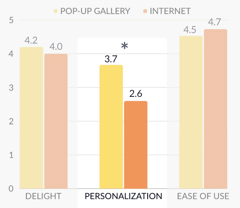
Only personalization ratings were found to be significant
(p = 0.002)
Delight and ease of use, however, were not significantly impacted based on our sample.
#2
Participants’ delight scores were improved only if they had a baseline to compare it to first.
Participants who did the internet phase first rated our gallery 0.375 points higher on average than ones who did the gallery first. Overall, this means that participants could have been biased based on which experiment phase they completed first.
#2
#3
Experimental design is extremely important, and we had to be intentional in executing our experiment to prevent confounding variables from getting in the way.
Inconsistencies in communicating experiment goals led some participants to base their ratings off of the art itself rather than the actual technological interaction.
#3
When asked to explain their delight score for the gallery, one user said:
“I thought the artworks here were less interesting than the ones I saw in the last phase.”
When asked to explain their delight score for the internet, one user said:
“I really liked the artwork I saw and the differences in the styles... I particularly like [sik]’s wet glass painting and [sik]’s underwater painting.”
#4
The experience isn’t always for everyone -- those that are used to going to art museums enjoy it for the physical experience.
Ultimately, it’s difficult to replace an in-person experience with a digital one!
#4
“To me, it felt too intrusive, almost aggressive, to get so close to the art pieces and to have to ‘touch’ them. This is probably baggage from normal museum experiences but I do like the distance and implicit respect that comes with the ‘no touch’ policy.”
“[The pop up gallery experience was] less fun [than a normal gallery] because there's no walking involved and also the artwork doesn’t feel like it is in-person versus like a display or a framed work.”
#5
The more casual consumers of art -- our original target audience -- seemed to enjoy and appreciate our experience more!
#5
“I prefer this method. It feels more at one's own pace and was more enjoyable. I never really go to art museums because I find them boring but pairing art with music makes it much nicer.”
“I like that I can hear music the artist picked out, that wouldn’t happen in a typical art gallery. I also like that I could tap on the artwork - I could never physically touch an artwork in a museum.”
REFLECT
Next Steps, Takeaways
As a 5-week culmination to our Human-Computer Interaction class, it was fulfilling to be able to focus purely on human interactions with technology outside of web and mobile design for the first time. In its current form, our team created not just an interface, but an end-to-end experience with mobile and projection interfaces as well as 3-D modeling prototypes. Ultimately, Art Oasis aims to provide users with a more casual, spontaneous way to interact with art outside of the formal museum space and provides local artists a platform to show off their work and processes.
In the future of our solution, we hope to improve our prototype based on the in-depth qualitative feedback we received through testing. This would primarily include adding suggested features like art/artist descriptions, more animations, and greater variety in artwork. We would also like to expand beyond “Wizard-of-Oz” type testing and build a physical pop-up gallery space and working projector prototype that can provide users the more immersive feel that we seek.
Thanks for reading! :)
Interested in more projects?
Florish
Growing cross-generational relationships through a rewards-based messaging platform.
UI/UX
OpiSafe
Expanding pharmacy-based knowledge through an opioid safety intervention tool.
UI/UX
