Time
Team
Skills
Deliverables
2 Weeks
User Research
Wireframing
UI/UX Design
Figma Prototype
Style Guide
2 Product Designers
We designed Florish — a dedicated, interactive messaging app that motivates teens and young adults to stay in touch with their older family members.
As our UI/UX Design capstone project, my partner and I were challenged to create a digital solution that bridges the gap between generations. Right from the get-go, it became clear that this generational gap manifests most tangibly within familial relationships.
BACKGROUND
As children age, they tend to feel more physically and emotionally distant from their parents or grandparents.

As older adults age, they become more isolated and their experiences disconnected from a changing world.

College-aged young adults, in particular, struggle in feeling guilty when they haven’t “done their part” in keeping in touch with family members.
At they same time, they also express that they no longer know how to have “casual interactions” with those that they haven’t spoken to in a while and that digital interactions feel increasingly superficial anyway.
PROBLEM
OPPORTUNITY
How might we lower the cognitive barrier of keeping in touch with loved ones who are geographically distant?
How might we create a short-form digital interface that motivates users to go beyond superficial interaction?
A garden-themed messaging platform where family members collaboratively grow a seasonal plant together and simultaneously cultivate a consistent and lasting relationship.


Responsive Messaging
Loved ones choose a seasonal plant to grow together each month. With each interaction (whether it be a text/photo message or a reaction to a message), the seed grows into a plant, and ultimately into flowers or fruits. This way, users are literally and figuratively cultivating their relationship.

Monthly Harvesting
Loved ones are then motivated to cultivate their harvest at the end of each month! In reaping the benefits of keeping in touch with their loved ones, users are then able to look back on their collection of crops and reflect on the relationships they have grown together.
SOLUTION
Now, how did we get to this solution?
Check out our design process below!
PROCESS OVERVIEW
User Interviews
Industry Research
Empathy Maps
User Personas
Journey Maps
POV Statements
HMW Statements
Brainstorming
Sketches
MVP Features
User Flow
Lo-Fi Wireframes
Style Guide
Hi-Fi Prototype
Usability Testing
Takeaways
Next Steps
RESEARCH
DEFINE
IDEATE
PROTOTYPE
TEST
REFLECT
RESEARCH
User Interviews
To begin narrowing our scope, we conducted interviews seeking to understand three major things about our users:
We found a common thread throughout all of our interviews:
1
What cross-generational relationships do users currently have?
2
Which of their relationships are most strained? Which have been most successful?
3
What forms of digital communication do our users already use? What are they lacking?
Users called to attention their qualms with maintaining familial relationships, especially while living away from home.
DEFINE
User Persona
With this insight in mind, I created a user persona that helps us empathize with the experiences and goals of our potential users:

DEFINE
HMWs
In conjunction with these objectives, I brainstormed a list of “how might we...” questions that could help us address user’s frustrations and narrowed them down to two primary questions we wanted to answer with our solution:
How might we lower the cognitive barrier of keeping in touch with loved ones and those who are not geographically close?
How might we create a short-form digital interface that can still prompt users to go beyond a superficial interaction?
DEFINE
Design Objectives
ENGAGING
We want to build positive habits for users to consistently come back to keep in touch with loved ones.
DELIGHTFUL
We strive to bring the delight and joy of child-like wonder to our users through their interactions.
INTUITIVE
Taking inspiration from existing tech, we hope to make something easy and recognizable for all users.
Using both the frustrations and goals I outlined in the user persona, we established a set of design objectives that we wanted to make sure our solution met:
IDEATE
Sketches, MVP Features
With our UX research and specific design objectives in mind, we started brainstorming, again, beginning broad and narrowing in.
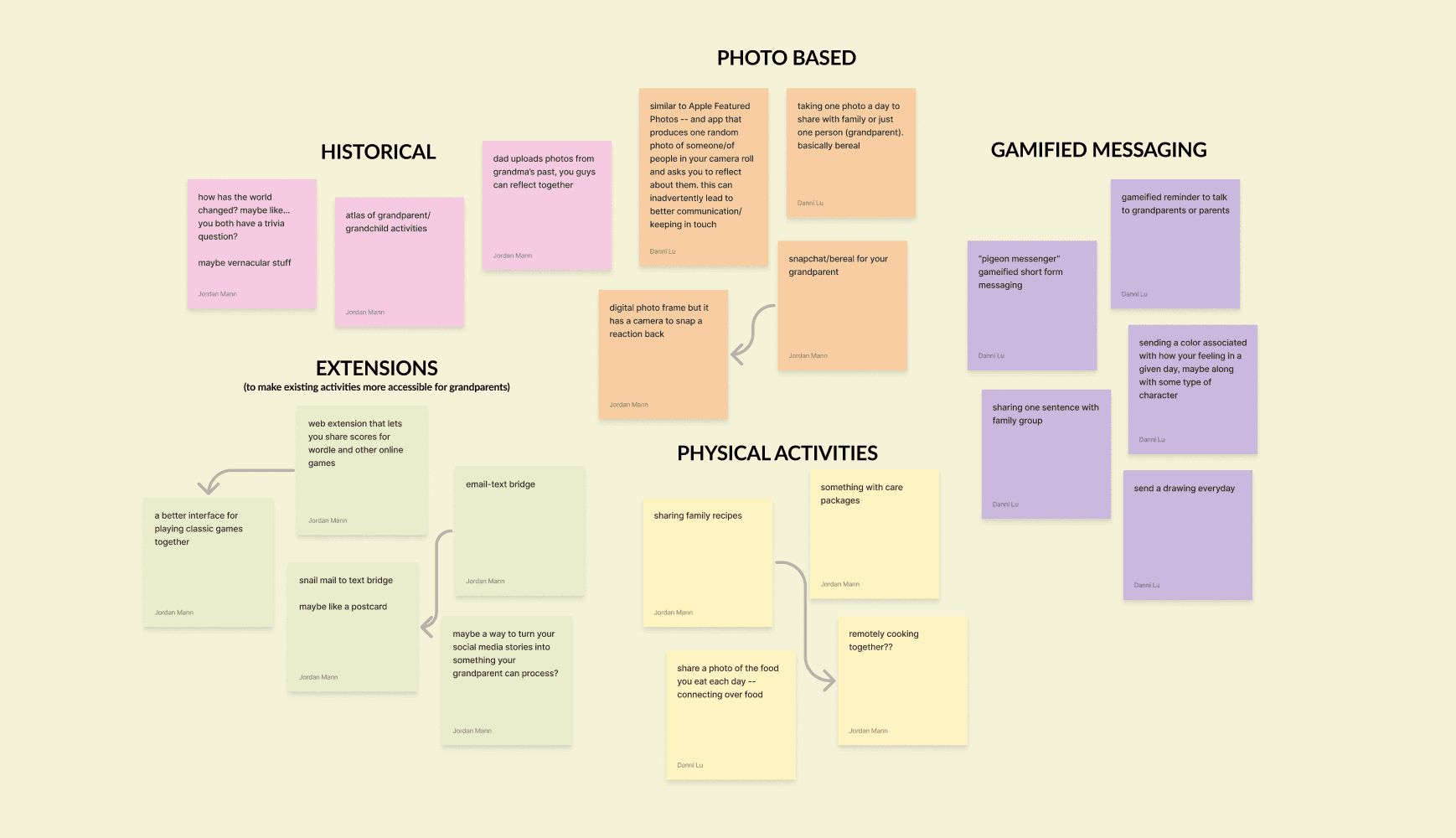
First, we conducted a 5-minute Post-It note brainstorm, then discussed our ideas and sorted them into different categories:
Then, we started sketching some of our favorite ideas. I used the Crazy 8’s method to put my ideas on paper, and I then expanded my sketches based on the idea of a gamified garden messaging app.
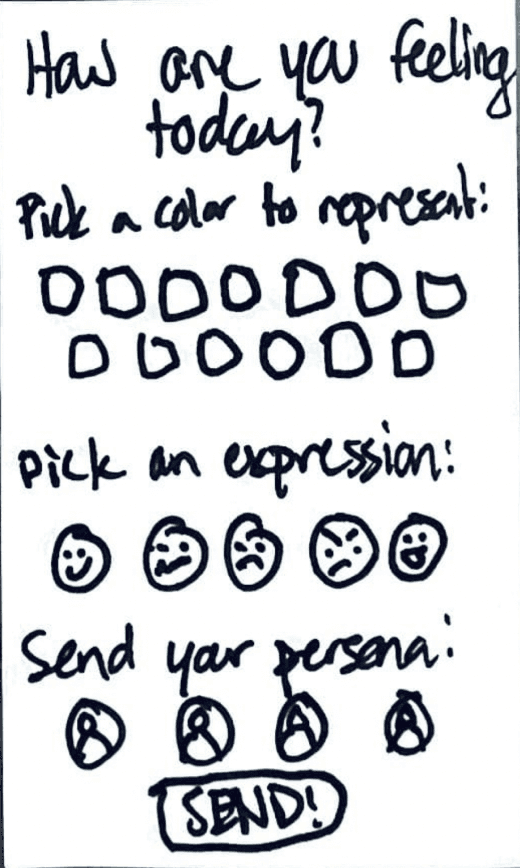
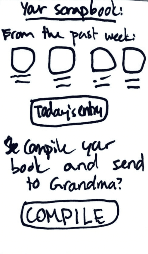
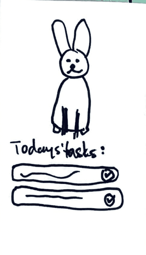
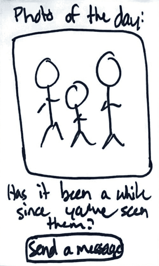
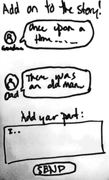
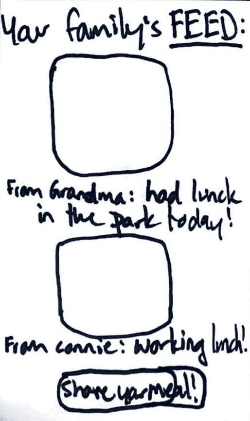
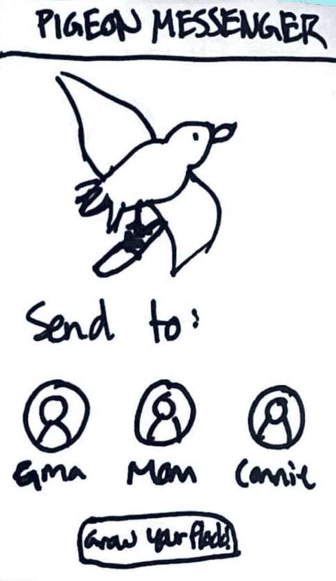
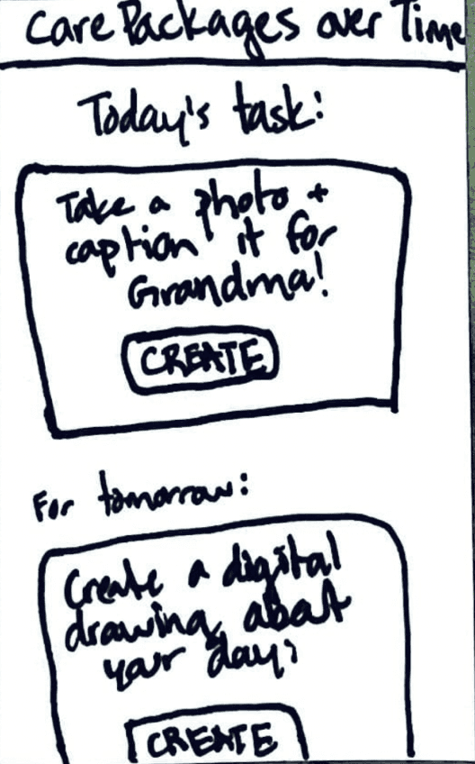
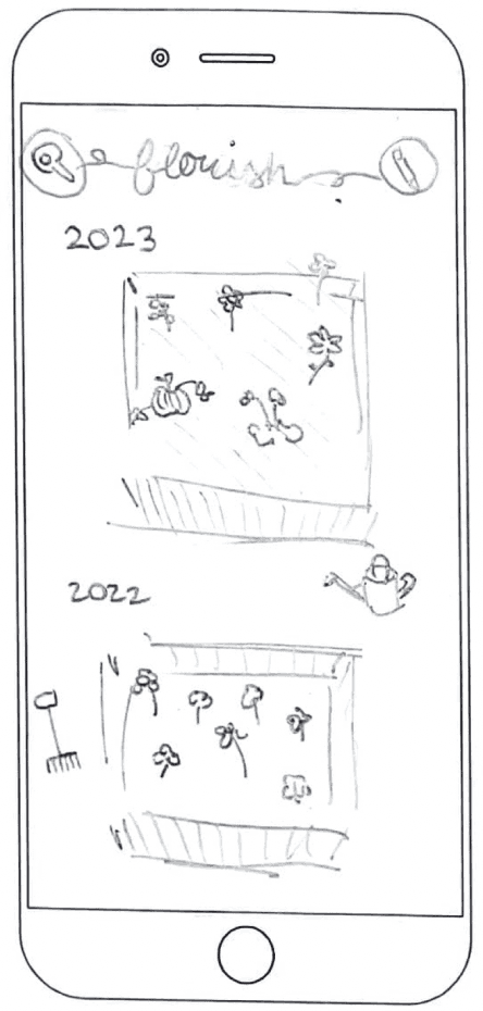
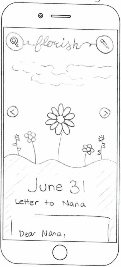
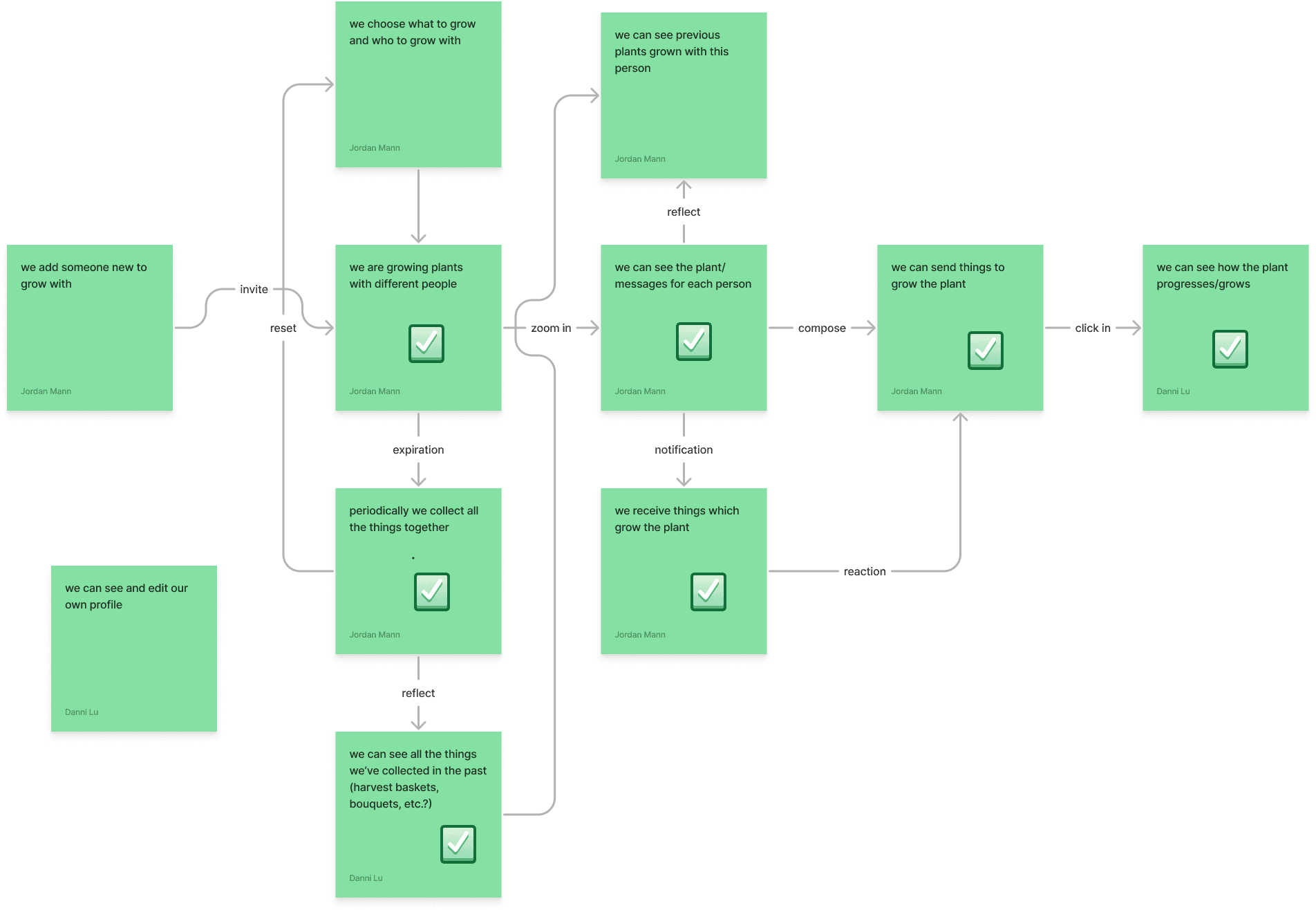
From this narrowed down concept, my partner and I brainstormed key features that best address our user needs while allowing us to operate within the timescale and scope of this project. From there, we created a user flow map to help us understand the key screens we would need in our prototype.
PROTOTYPE & TEST
Lo-Fi Wireframes
Keeping the short timeline of our project in mind as we moved into low-fidelity wireframes, we decided to initially focus our efforts to the two most important MVP features.
Garden-Themed Gamified Messaging
We created a rewards-based messaging feature in order to motivate younger children or teenagers to keep in consistent touch with older family members/loved ones. At the same time, we wanted to avoid making the gamification cheesy and still appealing to an older population. Taking inspiration from other gamified apps like Finch or Forest, we decided on a garden theme that also reinforces building natural and organic relationships and overall feel of the app.
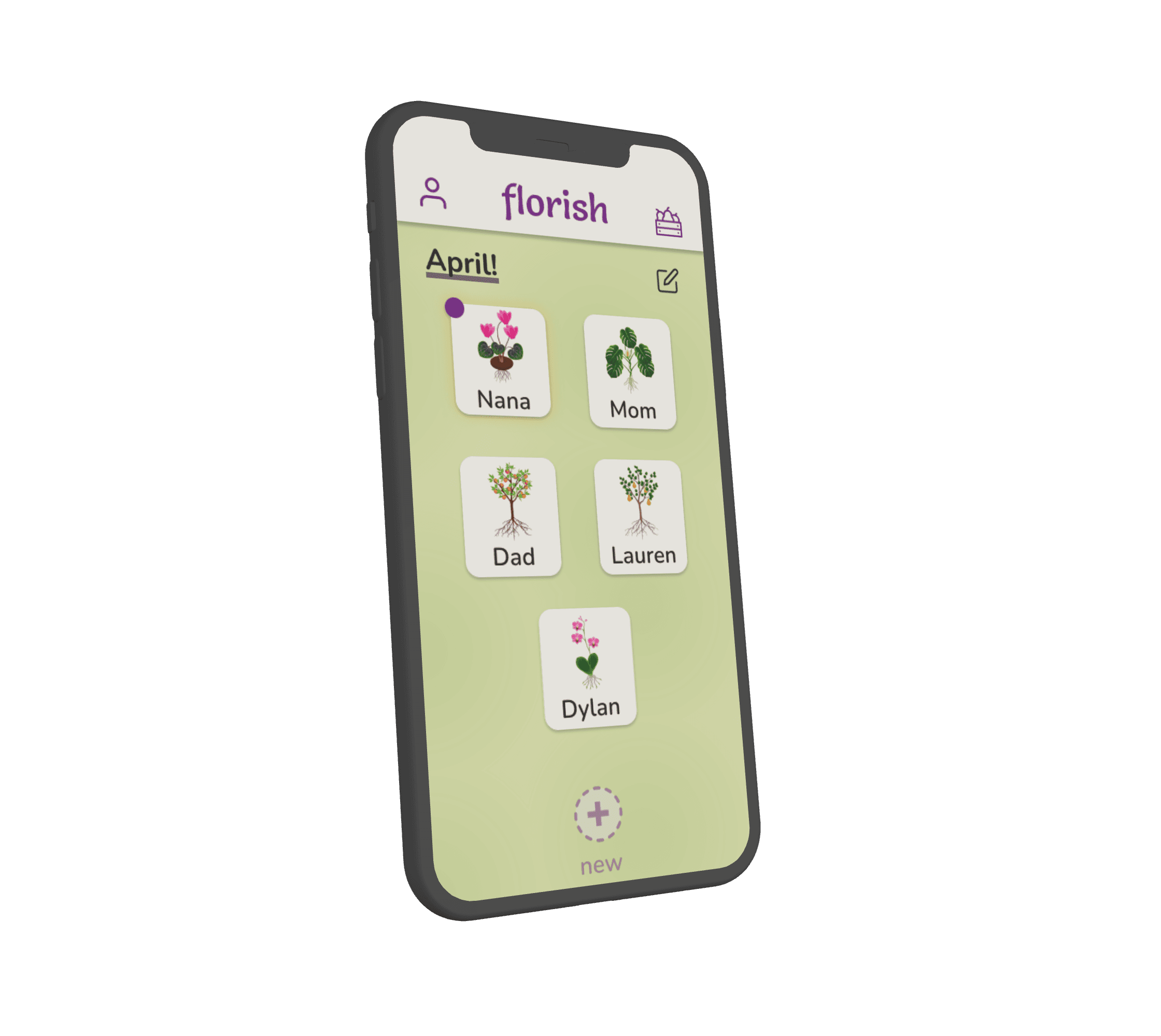
Home Page
View all active convos
Invite other loved ones to join
View personal profile
See past conversations
Conversations reset every month
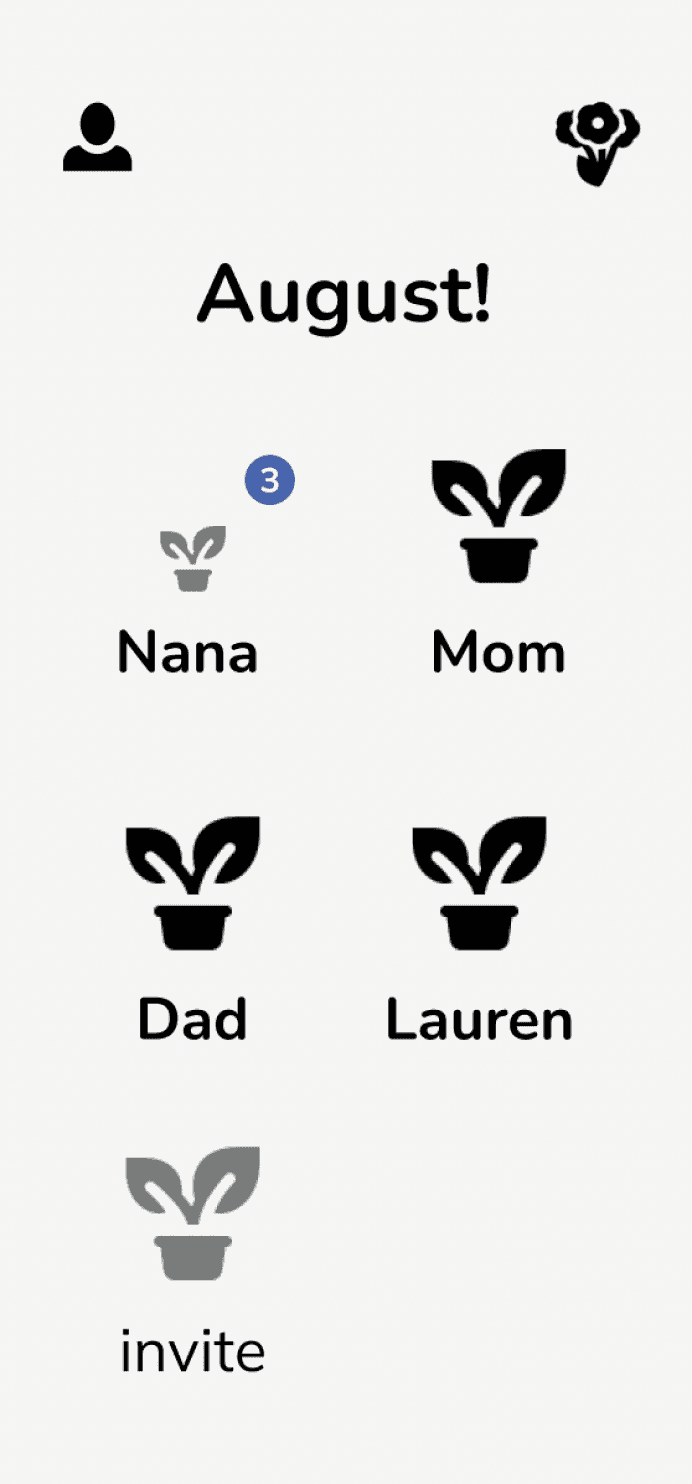
Every interaction grows your collective plant
View Nana’s profile and keep track of customizable monthly plant
Send images, text, or emoji reactions
Conversation Page
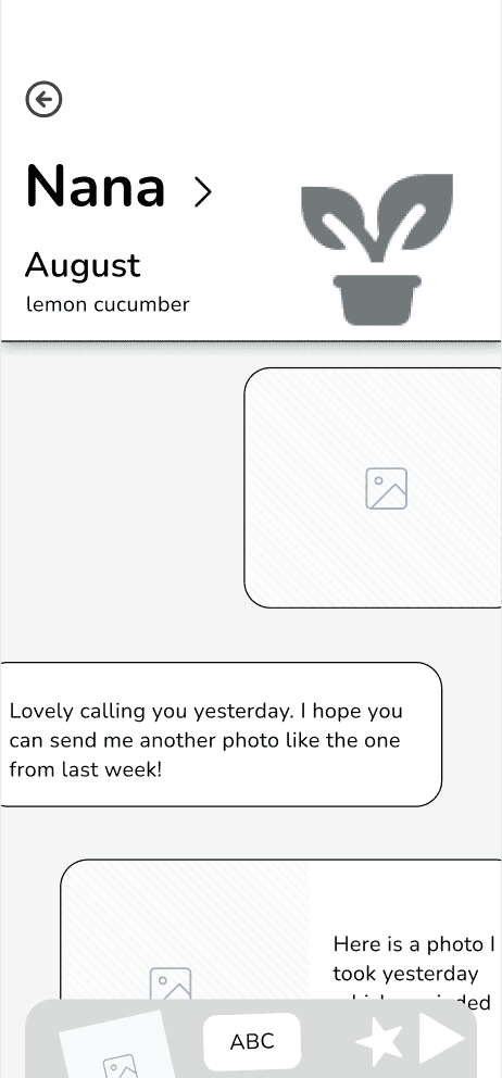
Monthly Harvesting and Reflecting
Plants (or conversations/relationships) that have been cultivated over the course of a month are then “harvested” and collected as a monthly “harvest basket” that users can view and reflect upon. We found through user interviews that a more limited time frame helps give them something tangible they can achieve/look forward to. While a week-long timeframe is too high maintenance, a month takes a bit of the pressure off while still keeping interactions consistent.
At the end of the month, you receive a pop-up that notifies you it’s time to harvest!
You are then able to click on each of your conversations in order to collect them into your monthly harvest basket.
Your harvest basket is saved with your previous months, and you are able to look back on past conversations, and scroll through a highlight of images to reflect on the month.

PROTOTYPE & TEST
Hi-Fi Wireframes, User Testing
As we solidified our UX direction, it was time to push our concept through to UI.
With the help of user feedback, we were able to build off of our grayscales and improve our design through 3 key changes.
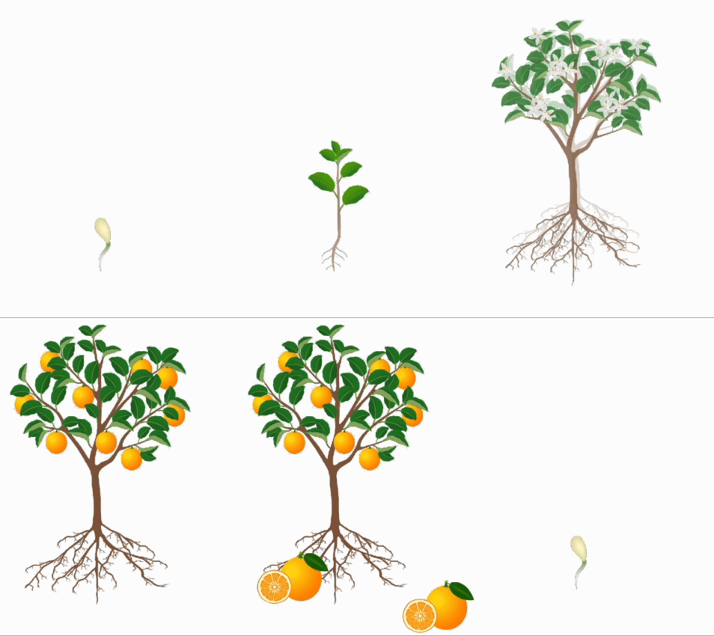
We prototyped animations that allowed the plant to “grow” with each new interaction to provide direct visual feedback. After a threshold number of initial interactions, each additional interaction would grow a fruit or flower that would add to the total amount harvested at the end of the month.
#1
#1
Users desired improved visual feedback of plant growth/progress, and better quantification of how individual interactions contributed.
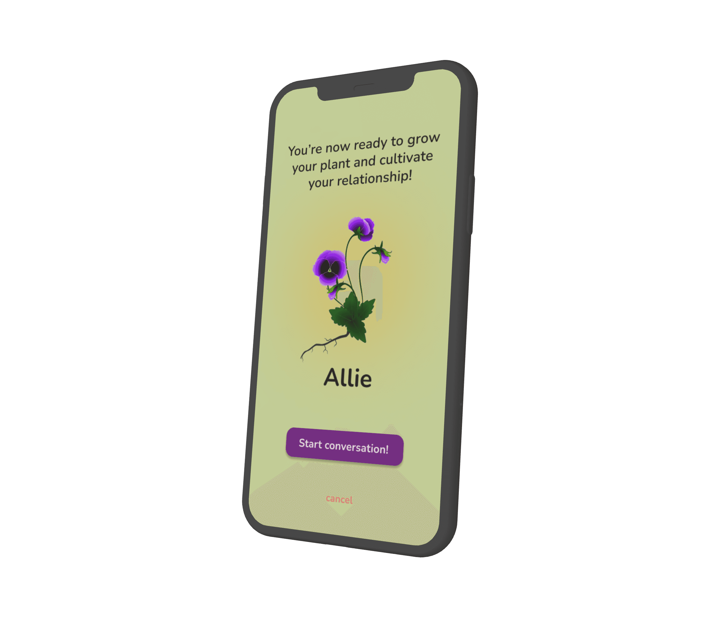
We added an additional user flow that would allow users to customize/choose what seasonal plant they wanted to grow with a loved one upon initiating a conversation with them.
#2
#2
Users hoped to be able to make the UI for different conversations reflect the individuality of the relationships themselves.
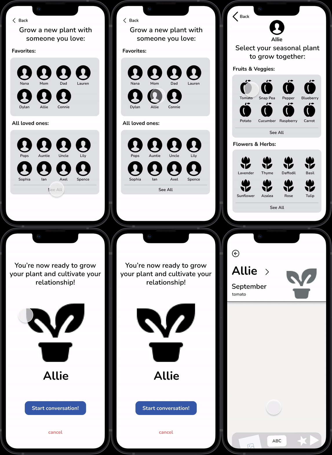

We designed and prototyped a series of delightful micro-interactions that made the monthly harvest a more exciting and visually intriguing action. Animations prototyped through Figma interactions then allowed for more visual feedback that tied into other prototyped features.

#3
#3
Users felt that the “harvesting” idea was clever but that there could be more responsive design that reflected this theme.

PROTOTYPE & TEST
REFLECT
Style Guide
Next Steps, Takeaways
Ultimately, this project was extremely rewarding. As my first end-to-end UI/UX design project, it was a challenge to scope and then execute our full process in 2-weeks during a busy final exam period. In its current form, Florish’s key features make it easier for users to build healthy communication habits with their loved ones.
While our initial scoped goal was to connect our “Nostalgic Empathizers” with their older loved ones, we designed our app with their specific age range and technical fluency in mind. So, going forward, we would like to expand our user testing to an older population. In addition, we would love to make our design fully responsive to tablets and web. For loved ones who may not have easy access to technology, we also considered creating an extension of the app that would allow the user to compile monthly journals or scrapbooks that could be delivered over email or in a physical print.
Other ideas include implementing a changing color theme and set of plants for every season (the one we prototyped with would be for spring!), creating an guided onboarding tutorial, and increased accessibility testing.
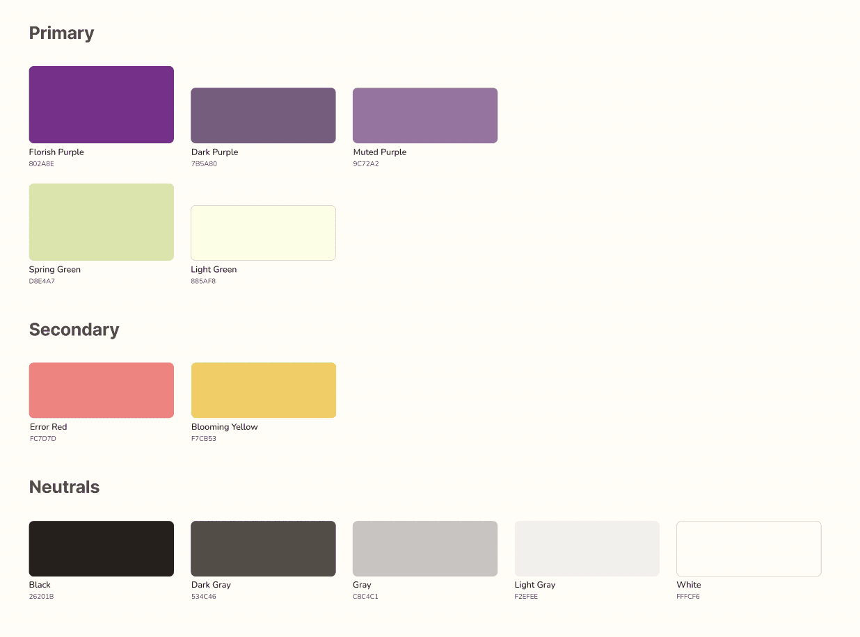
Colors
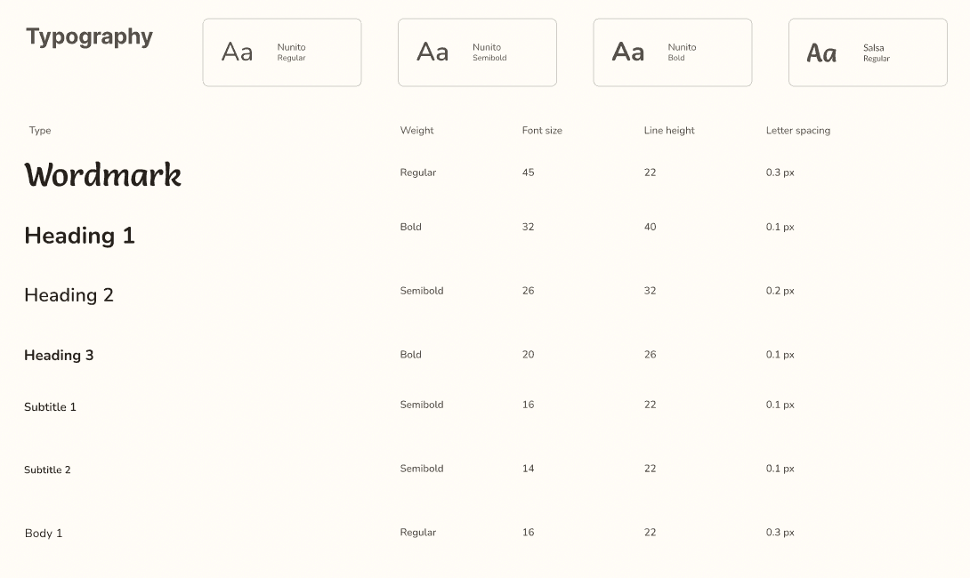
Typography
We chose green and purple as our primary colors because they contribute to an organic but playful feel that can appeal many different age groups. While sticking to our natural theme, they still provide visual contrast and excitement.
We used the font “Nunito” for its easy readability. We knew that our graphics would make the interface look busy and wanted to keep it simple and legible. We chose “Salsa” for our wordmark because it adds a floral touch and some visual interest!
Thanks for reading! :)
Interested in more projects?
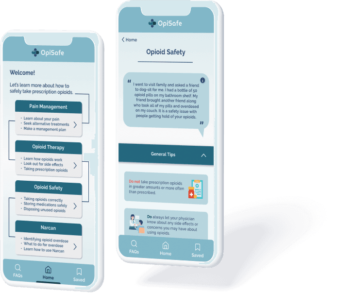
OpiSafe
Expanding pharmacy-based knowledge through an opioid safety intervention tool.
UI/UX
Art Oasis
Lowering the barrier to casual art consumption through an interactive art gallery
UI/UX
