OpiSafe
Expanding pharmacy-based knowledge through an opioid safety educational tool.
UI/UX Designer
Time
Team
Skills
Deliverables
10 Weeks
Grayscales
Figma Prototype
Style Guide
Usability Testing Guide
Partner Relations
Prototyping
2 Product Designers
1 Project Manager
We designed OpiSafe — a centralized place to find opioid safety information that decreases the knowledge gap between physicians and patients.
People who are prescribed opioids need an individualized way to find unbiased information about safe opioid use.
We want to put the knowledge in the hands of the patient, so...
How might we bridge the knowledge gap of prescribed opioid use without further burdening a patient who’s in pain?
As part of their post-doctoral research in the realm of opioid misuse intervention, our client partnered with our team at the DALI Lab with the goal of creating an MVP digital app that includes educational modules specifically targeted at bridging the knowledge gap between physicians/pharmacists and their patients who are prescribed opioids and decreasing the negative rhetoric surrounding opioid use.
Our client’s long-term research goal is to implement and disseminate a personalized, patient-centered digital intervention app to improve care for substance use disorders, which would include symptom screening as well as personalized educational feedback.
Currently, there is a knowledge gap between doctors/pharmacists and their patients. Patients are too often not receiving adequate medication use information when prescribed -- in the case of opioids in particular, there can be dangerous repercussions to misinformation or lack of knowledge.
BACKGROUND
PROBLEM
OPPORTUNITY
Patients prescribed opioids start their regimens uninformed and on their own. Without a centralized place to find information, they are also susceptible to the “opioid mania” relayed in the media.

Doctors and pharmacists are often too busy to talk through the nuances of taking opioids. The information they provide is also vulnerable to being swayed by the negative rhetoric surrounding opioids.


Educational Modules
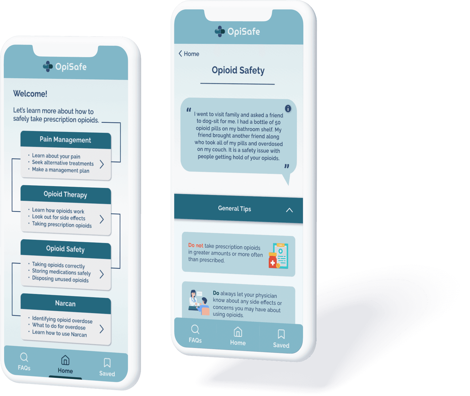
The focal point of our solution is a set of 4 educational modules on pain management, opioid therapy and safety, and Narcan use. Through features like segmented controls, progressive disclosure, and a series of accordion drop-downs, dense information is displayed in a manner that is easily processable for users.

Frequently Asked Questions
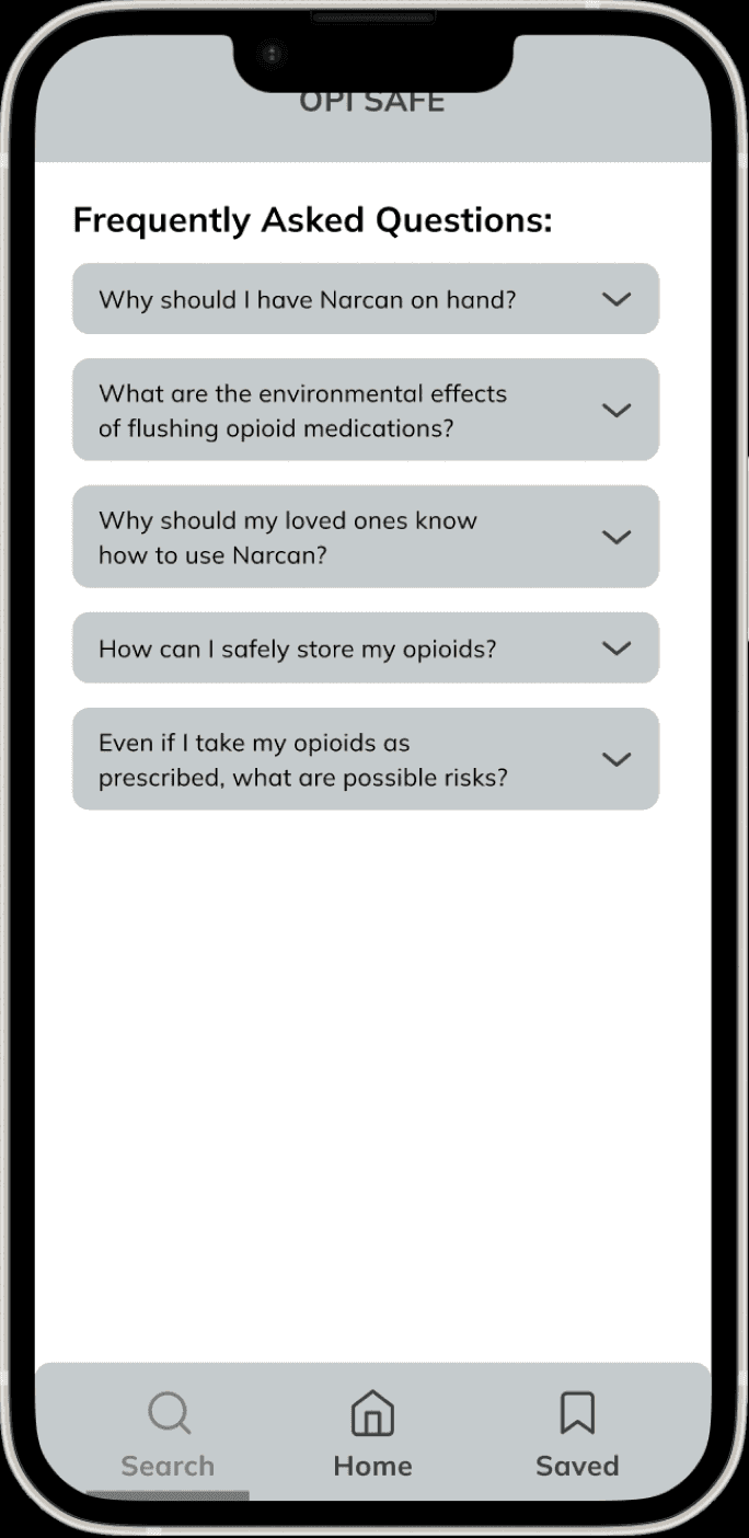
To provide users a different format to find information, we created a FAQ/search page. FAQs were curated based on real questions opioid patients disclosed about their experience during our user interviews and, in some cases, includes pertinent information that could not be outlined in the educational modules.

Bookmarked Sections
In order to give users another avenue to breakdown this dense information, users have the ability to save a given dropdown section which can then be quickly and easily found again in their “Saved Sections”. They can then refer back to them at any time, and also unsave them as they please.
A centralized mobile app that prescribed opioid patients and their loved ones can consistently return to for holistic, pharmacy-based information about opioid safety and Narcan use.
OpiSafe
SOLUTION
Now, how did we get to this solution?
Check out our design process below!
Industry Research
User Research
Empathy Maps
User Personas
Journey Maps
POV Statements
HMW Statements
Brainstorming
Sketches
MVP Features
Lo-Fi Wireframes
Style Guide
Hi-Fi Prototype
Usability Testing
Takeaways
Next Steps
PROCESS OVERVIEW
RESEARCH
DEFINE
IDEATE
PROTOTYPE
TEST
REFLECT
RESEARCH
User Research, Empathy Map
Due to the limitations of our client’s IRB-approved research, our research consisted of reading and analyzing interview transcripts that our client had previously conducted.
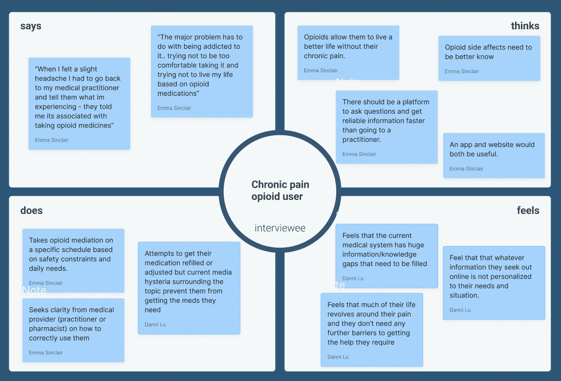
In taking direct quotes from transcripts, we mapped out user sentiments in an empathy map:
DEFINE
User Persona, Insights
This led us to consolidating our insights into bright spots and pain points, and then created a user persona that outlined key aspects of their experience:
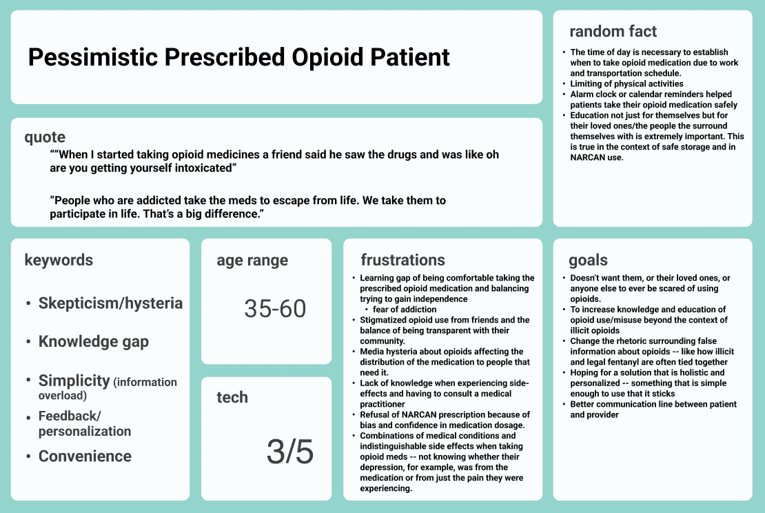
I distilled aspects of the Pessimistic Prescribed Opioid Patient’s experience down to a series of important insights:
There is a learning gap in becoming comfortable taking prescribed opioids while also maintaining a level of independence and control in their own life.
Media hysteria and stigmatized opioid use has made relationships with support systems (like doctors and family members alike) complicated for patients.
Ambiguities in side effects with relation to other medical conditions is a cause for hesitancy in taking opioid medications and muddles their health care regimen.
Ultimately, the experience that a prescribed opioid patient goes through is already complicated enough. In fact, the very reason they are seeking out an opioid medication regimen is because they are in pain. We want to ensure that our solution would lift some weight off their shoulders, rather than add to the burden they are already bearing.
DEFINE
POV Statement,
HMWs
With this sentiment in mind, we further narrowed down our problem area by writing a point-of-view-statement.
In preparation to begin brainstorming solutions, we asked ourselves a series of “how-might-we” questions that continued to narrow down what our team was looking for:
A patient who is unfamiliar with their newly prescribed opioid medication NEEDS an outlet for self-education for safe opioid and Narcan use IN ORDER TO fill in their current knowledge gap and de-stigmatize opioid rhetoric for the benefit of their personal health and quality of life.

How might we provide safety information about opioid use without scaring the user and feeding into the negative rhetoric about current opioid and Narcan information?
How might we provide quality information to the user without the need for waiting time or apprehension when searching for answers from their healthcare provider?
How might we fill in the knowledge gap without incurring any added annoyance for someone who is already dealing with pain and other difficulties?
How might we create a solution that is simple enough to comprehend by people of all backgrounds while also providing the information that patients need?
IDEATE
PROTOTYPE & TEST
Sketches
Lo-Fi Wireframes
Crazy 8s and solution sketches helped us get our “out-there” ideas in front of our client.
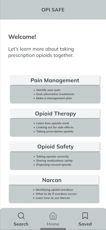
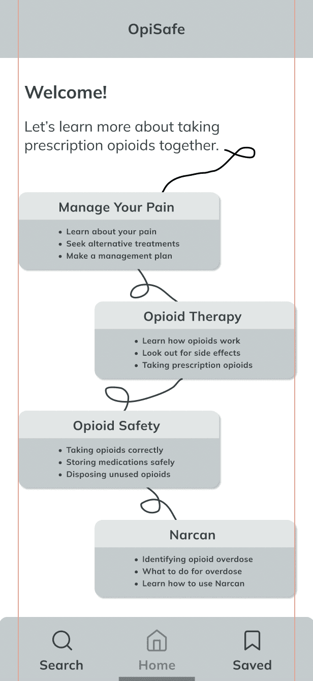
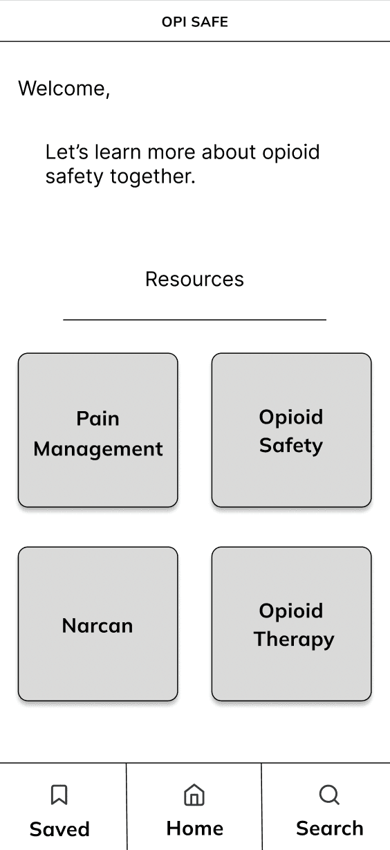
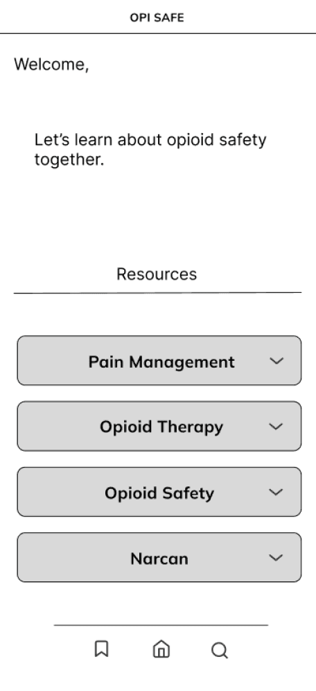
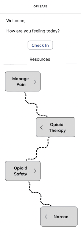
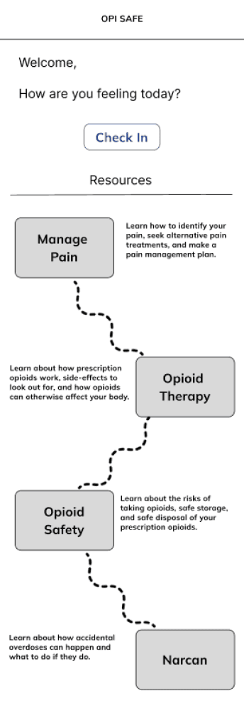
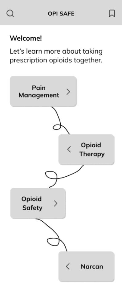
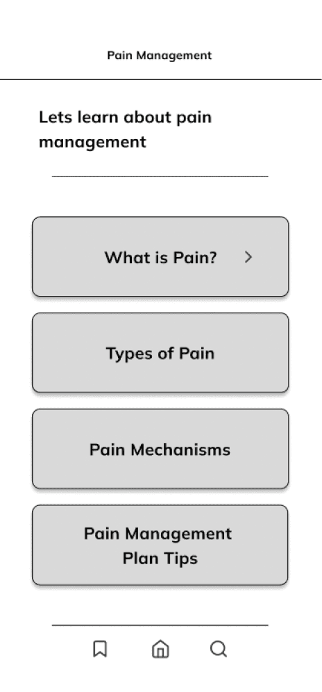
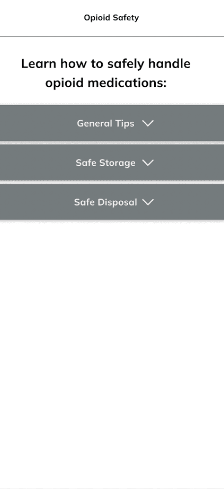
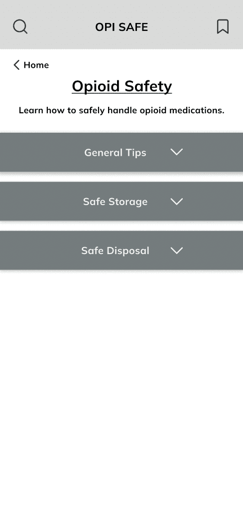
In the grayscale stage, we went through 4 rounds of iterations and feedback.
Based on client and user feedback on the best aspects of these ideas, we dove into grayscales to create a practical, but innovative way to display a whole lot of content.
Our primary focus in these 4 rounds was to narrow the UX of our home page, as well as our overall structure and organization of educational content within the four modules.
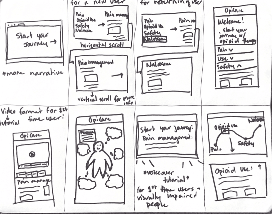
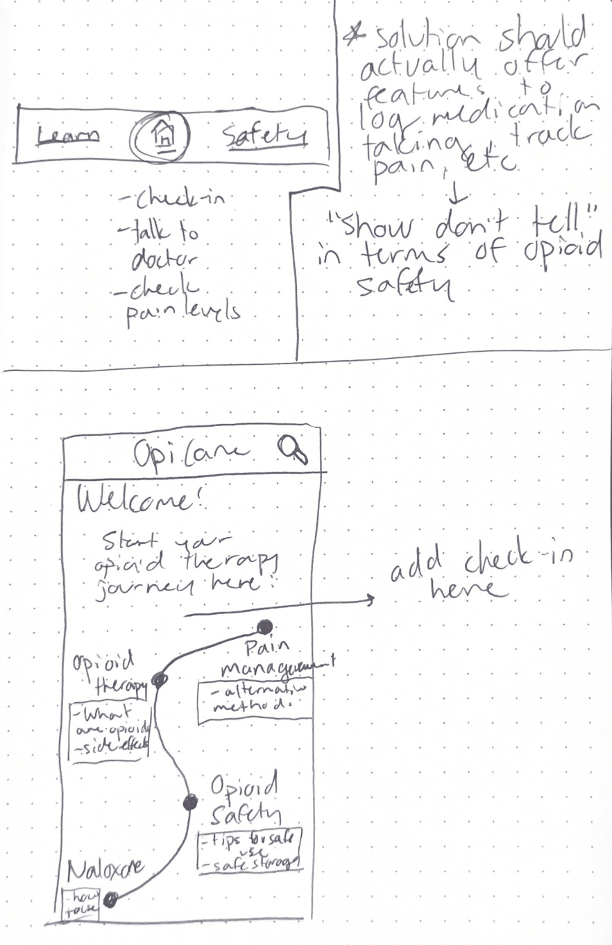
Home Page
Content Organization of Each Module
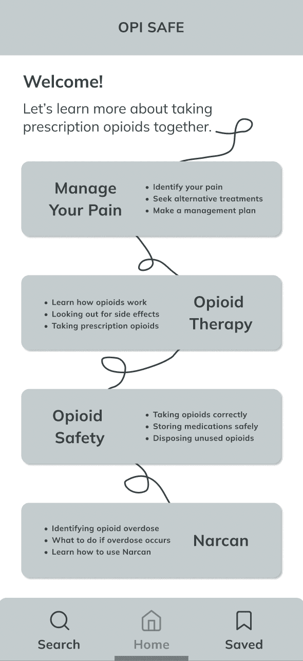
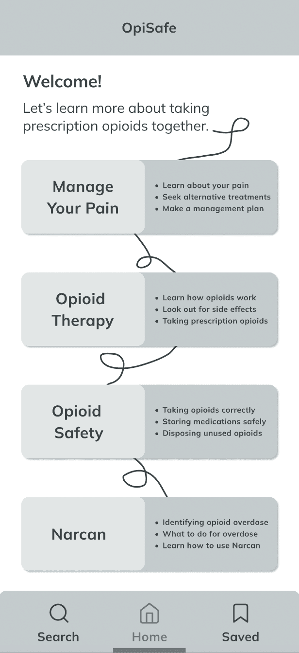
Round 1
Round 2
Round 3
Round 4
Round 1
Round 2
Round 3
Round 4

PROTOTYPE & TEST
Hi-Fi Wireframes
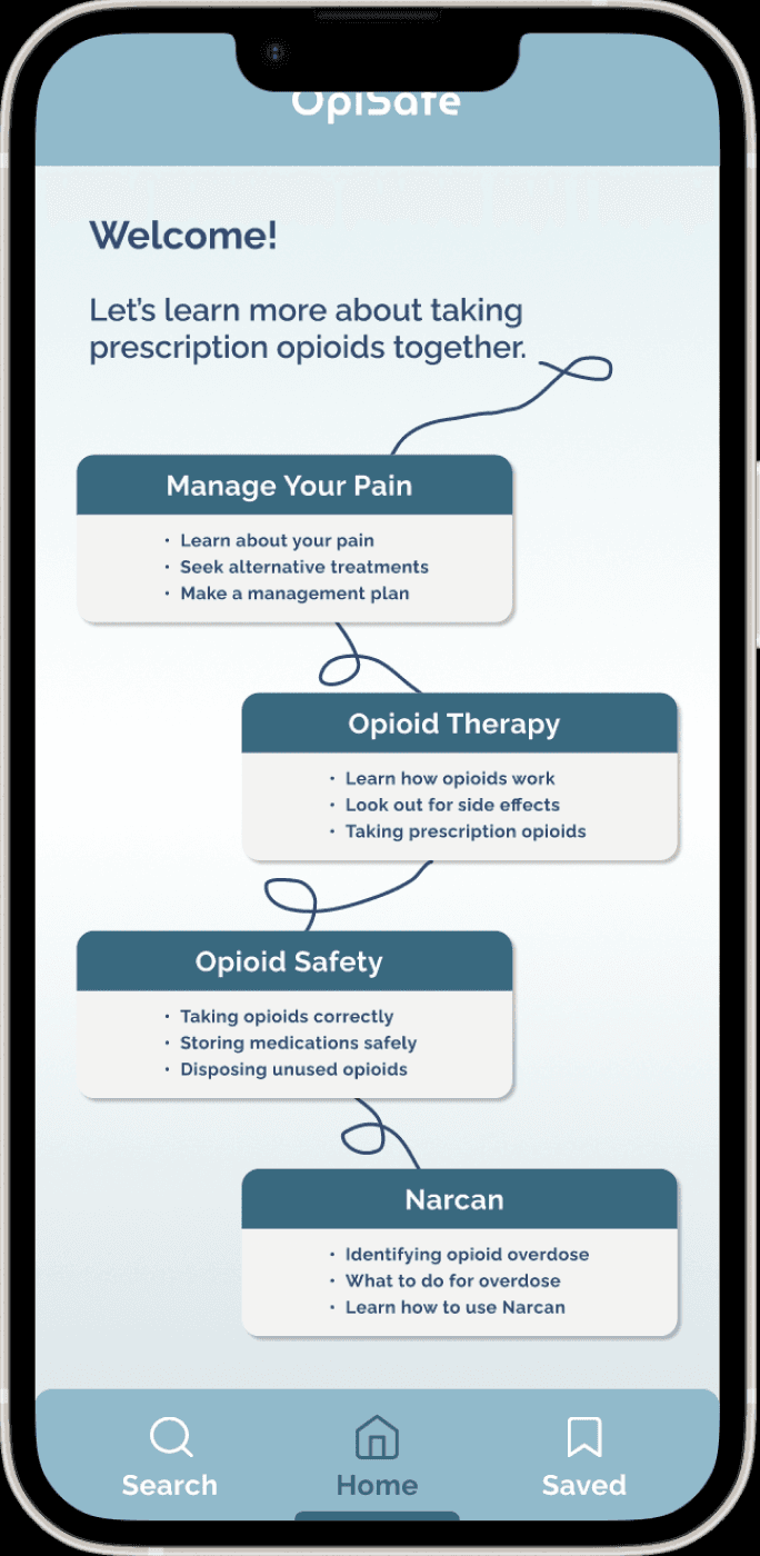
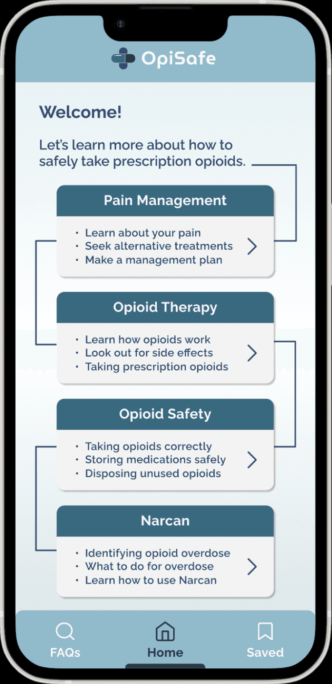
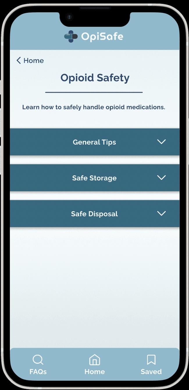
While preserving as much spacing as possible, we increased text size, adjusted our drop shadows, and added a pointer arrow that denotes that there is more information to explore on the next page. Because this made the four module boxes larger, we had to adjust and move away from our UI from curly lines that represented what a patient’s journey through their treatment might look like.
#1
#1
Users felt that text and clickable areas on the home page were too small and didn’t quite look “clickable” enough.
With our UX narrowed down through some intense iteration, it was time to push our concept through to UI.
With the help of client and all-lab feedback, we were able to build off of our grayscales and make 3 core design decisions in UI.
After sending over a couple different options for each of the 4 modules, we were originally unsure how to incorporate the narratives in -- Is there a dropdown for narratives in each of the modules? Is there one big module for narratives? Ultimately, we decided to place a composite narrative at the top of each corresponding module (with a disclaimer that they weren’t direct quotes). This would allow an app user to prime and humanize the clinical information they would be reading with a real, emotion-filled story.
#2
#2
Our client came back to us during our UI process with the hope of adding real narratives from prescribed opioid users.


We wanted to provide app users not just another way to navigate through dense, complex information, but an easier and more intuitive way to do so. Hence, we added a search feature to the FAQs page that would allow users to search key words/phrases to find both the FAQ that was most closely related as well as the corresponding accordion section. This allows smaller, more digestible portions of information to be found in different formats throughout our solution.
#3
#3
Users found that a list of FAQs was helpful to find information in a different format than the modules, but that it would create a similar difficulty as “just another list of dropdowns”.
REFLECT
Next Steps, Takeaways
Ultimately, this project has been one of my most fulfilling ones to date. Although I had worked with clients in the past, I had not yet worked formally with a client on a UI/UX project, and I had a lot to learn from it. Most importantly, I learned about the importance of managing partner relations and expectations, as well as consistent communication throughout the project to keep open a direct pipeline of feedback on each iteration of our prototype.
In the future, with this prototype being used as part of a formal IRB research study, we plan to collaborate with our partner to create a user testing guide, and eventually receive much more in-depth feedback on our work from potential users of our application. With that feedback, we would love to continually iterate upon our designs and be able to hand off our prototype to a development team that could bring this vision fully to fruition.
PROTOTYPE & TEST
Style Guide
Colors
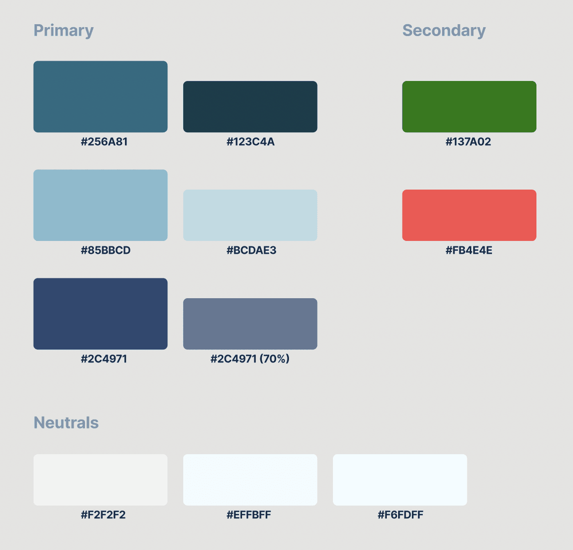
We primarily chose a set of blue hues, keeping our solution clean, simple, and easily legible with the large amount of text content involved. Keeping this in mind, we incorporated warmer-toned teals to soften the feel of the app and minimize the clinical feeling of a medication-based solution.
Typography
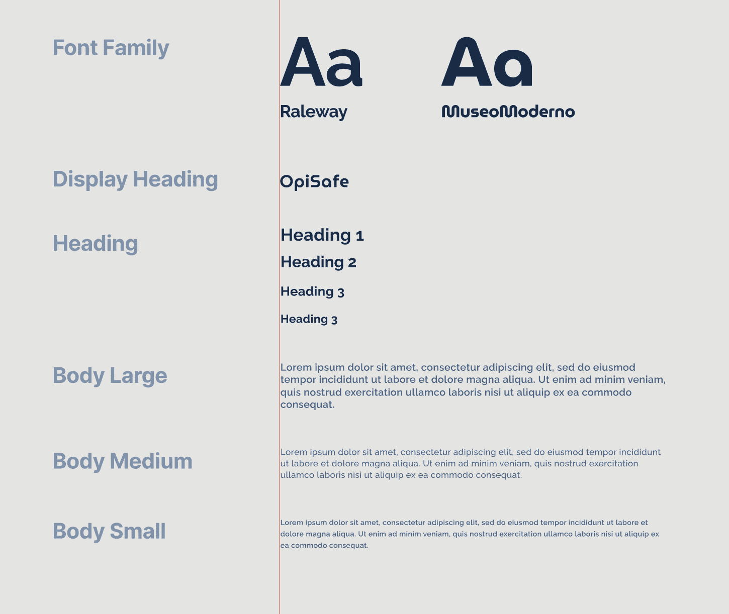
We chose the font Raleway because it is an easy-to-read sans serif font with rounded corners to help soften the feel of information that is relatively serious by nature. For our wordmark, we chose MuseoModerno which is complementary but provides some visual interest to the brand.
Thanks for reading! :)
Interested in more projects?
Florish
Growing cross-generational relationships through a rewards-based messaging platform.
UI/UX
Art Oasis
Lowering the barrier to casual art consumption through an interactive art gallery
UI/UX
